Somewhere, a new home is waiting – Campaign for Maia Imobiliare
Nobody buys a home just because of the square metres. Creatif Agency built a real estate campaign for Maia Imobiliare around the moments that actually make the decision, replacing listings and floor plans with a single word that scales indefinitely. Somewhere.
Maia Imobiliare is the most established real estate agency in Sibiu, Romania. Creatif Agency has worked with them since 2024, first on a full brand refresh and website redesign, then on a brand positioning campaign built around outdoor placement, and now on a campaign that moves the brand somewhere the category has not been.
Each phase has built on the last. The identity gave the brand a standard to hold. The website gave it a platform. This campaign gives it a voice.

The category problem
Real estate marketing in Romania is almost entirely specification-led. Square metres, room count, price per square metre, a wide-angle photograph of an empty living room shot in flat daylight. Every agency uses the same visual language, which means no agency owns any of it.
The consequence is that buyers compare listings rather than choosing agencies. When every brand communicates identically, the only remaining variable is price, and the agency becomes a search filter rather than a name anyone remembers.
For a market leader, that is an expensive position to sit in.
The insight
Nobody buys a home just because of the square metres.
They buy it for the first morning in a kitchen that finally belongs to them. For the room that will hold a child’s birthday. For the hallway where the dog waits. The specifications justify the decision after it has already been made emotionally.
No property listing has ever communicated one of those moments, which meant the entire emotional territory of the category was unoccupied.
The concept
One word carries the campaign: Somewhere.
Every execution opens with it and completes it differently. The word does the work before the image registers. It implies distance, possibility, and something already in motion, waiting to be found by someone who has not arrived yet.
The full copy system:
- Somewhere, a house is waiting for you
- Somewhere, a new home is waiting
- Somewhere, someone’s next chapter is about to begin, and there’s a home waiting
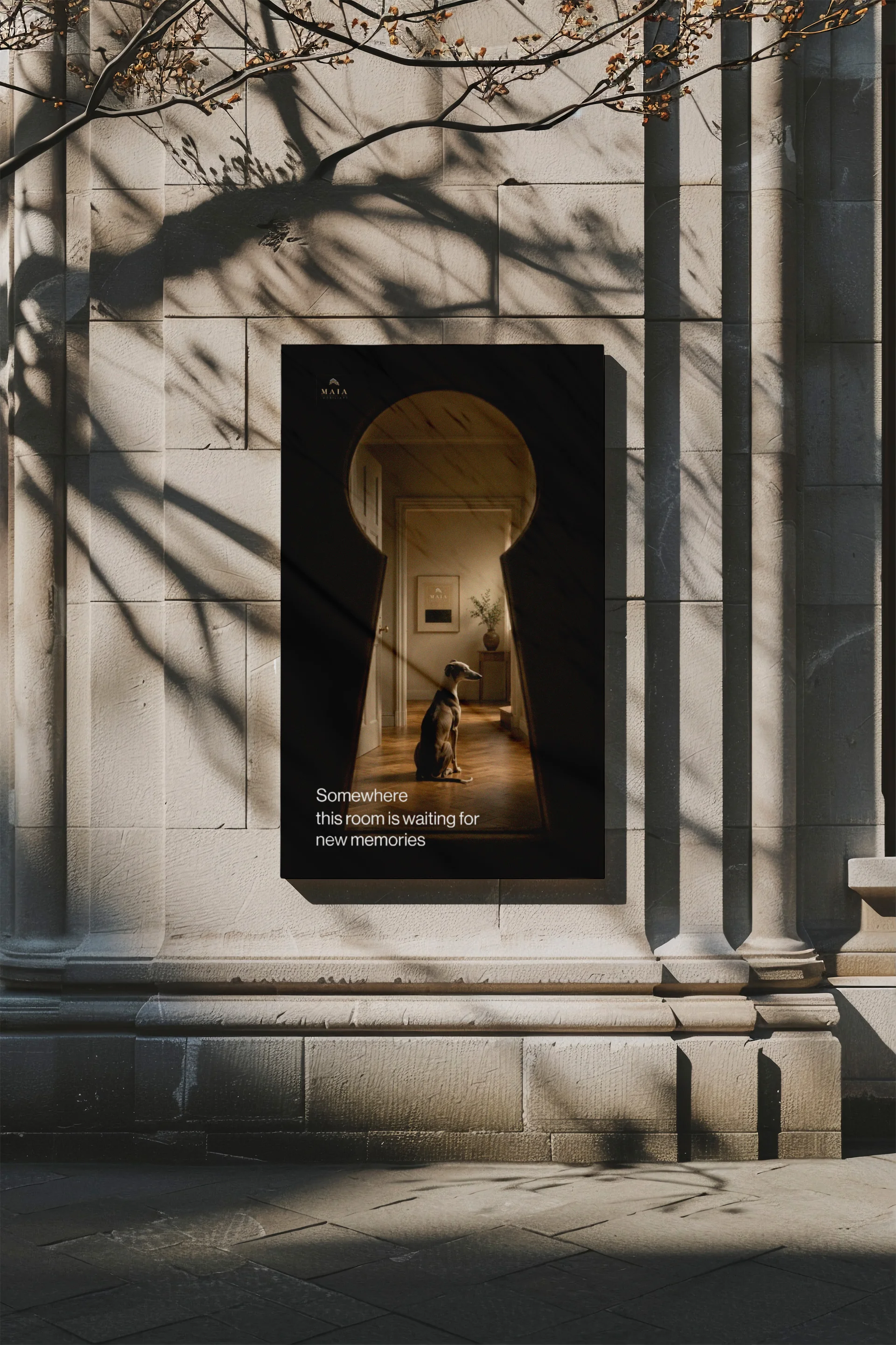
- Somewhere this room is waiting for new memories
- Somewhere someone is waiting for mornings like this
The mechanic is deliberate. The opening word is fixed, which makes the campaign instantly recognisable across placements. The completion changes, which keeps repeated exposure interesting rather than repetitive. The construction scales indefinitely, so the campaign can extend into new executions for years without a new concept.
Not one line mentions a property, a price, or a service. The brand sells arrival, and the property becomes the route to it.

Art direction
The visual language was built to read as cinema rather than advertising. Warm interior light against deep black. Restrained neutrals. No stock photography treatment, no wide-angle interiors, no people smiling at a camera.
The keyhole series
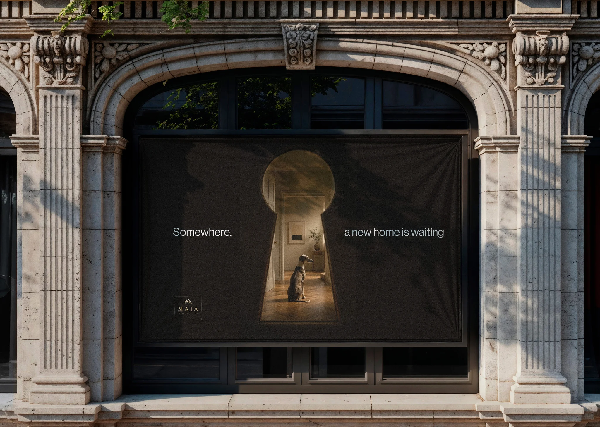
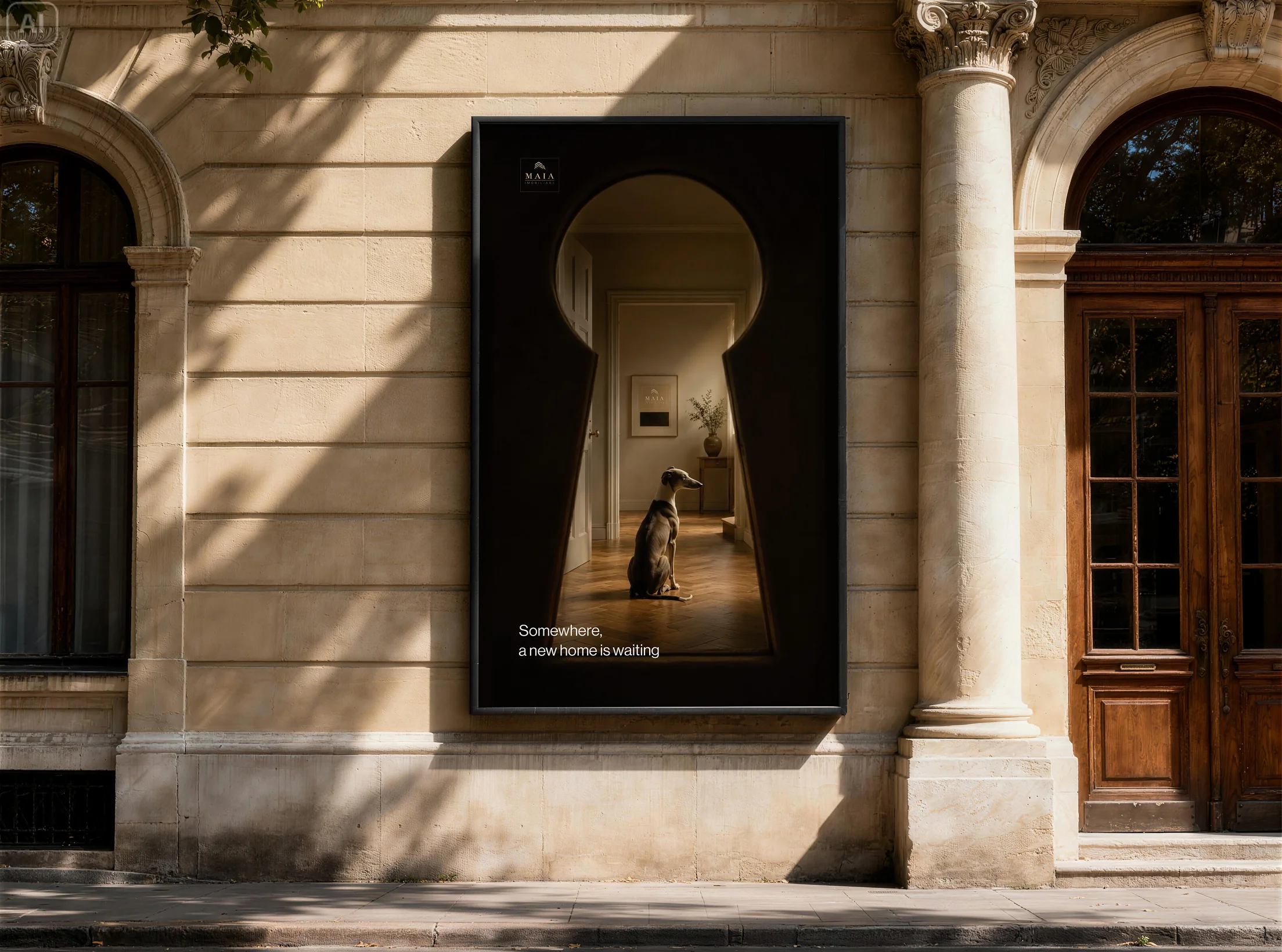
A greyhound sits in a sunlit hallway, seen entirely through a keyhole. The frame is close to fully black, with warm light escaping through the aperture.
The viewer is placed outside, looking in on a life already happening without them. It is the most direct expression of the campaign idea in the set, and the strongest performer at scale. On a large-format placement the black holds the eye against surrounding architecture, and the illuminated centre becomes the only thing in the field of view.
This became the hero execution and the anchor of the campaign system.
The pillow portraits
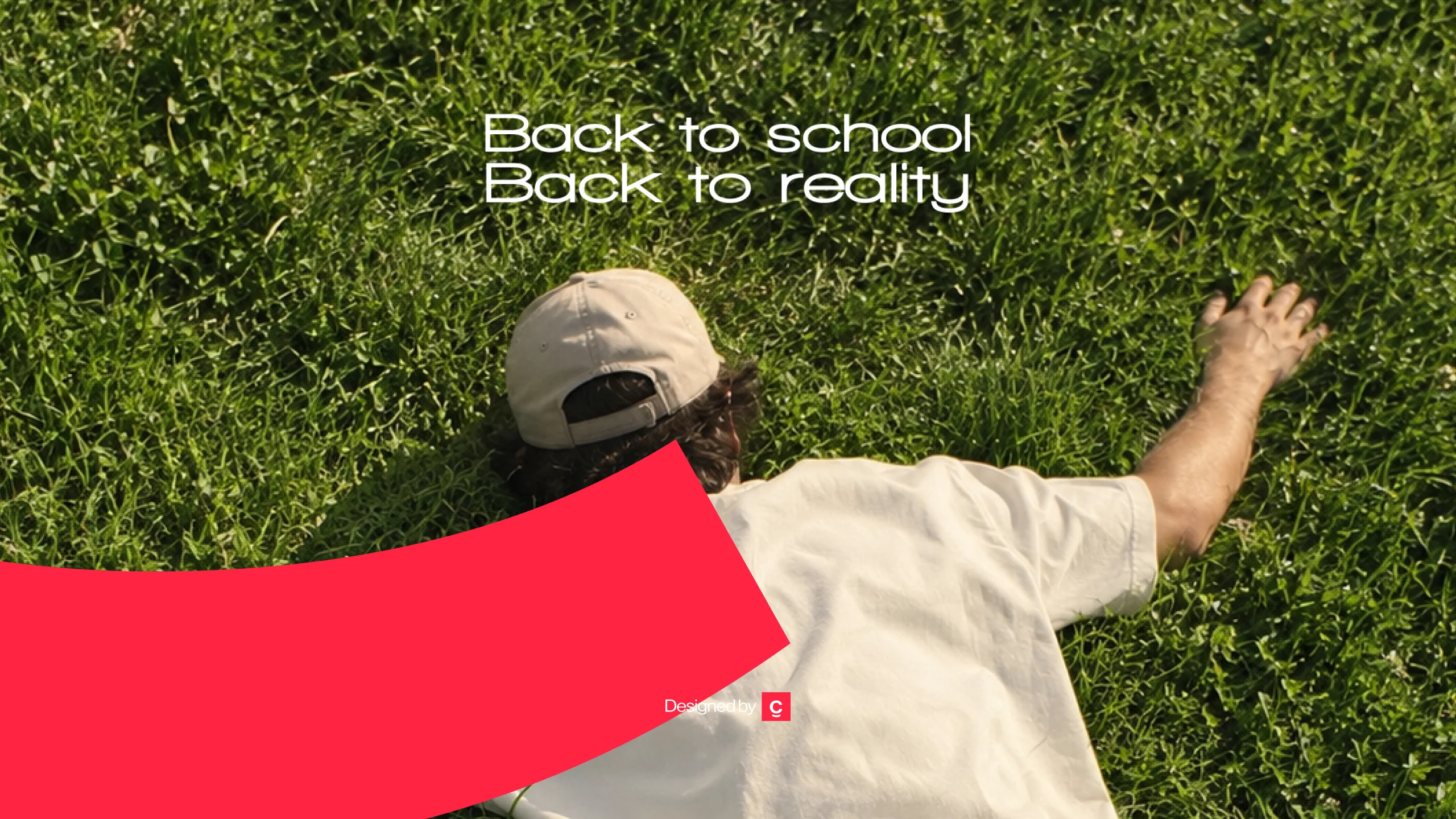
A figure photographed from behind, a pillow resting on their head, against soft blue. Surreal, quiet, and slightly absurd.

The image communicates rest, home, and belonging without showing a single interior. It also gives the campaign a lighter register, which prevents the emotional tone across the full set from becoming uniform.
The doorstep
Somewhere, someone’s next chapter is about to begin. A stack of unopened newspapers on a stone step in front of a closed door. Nothing else.
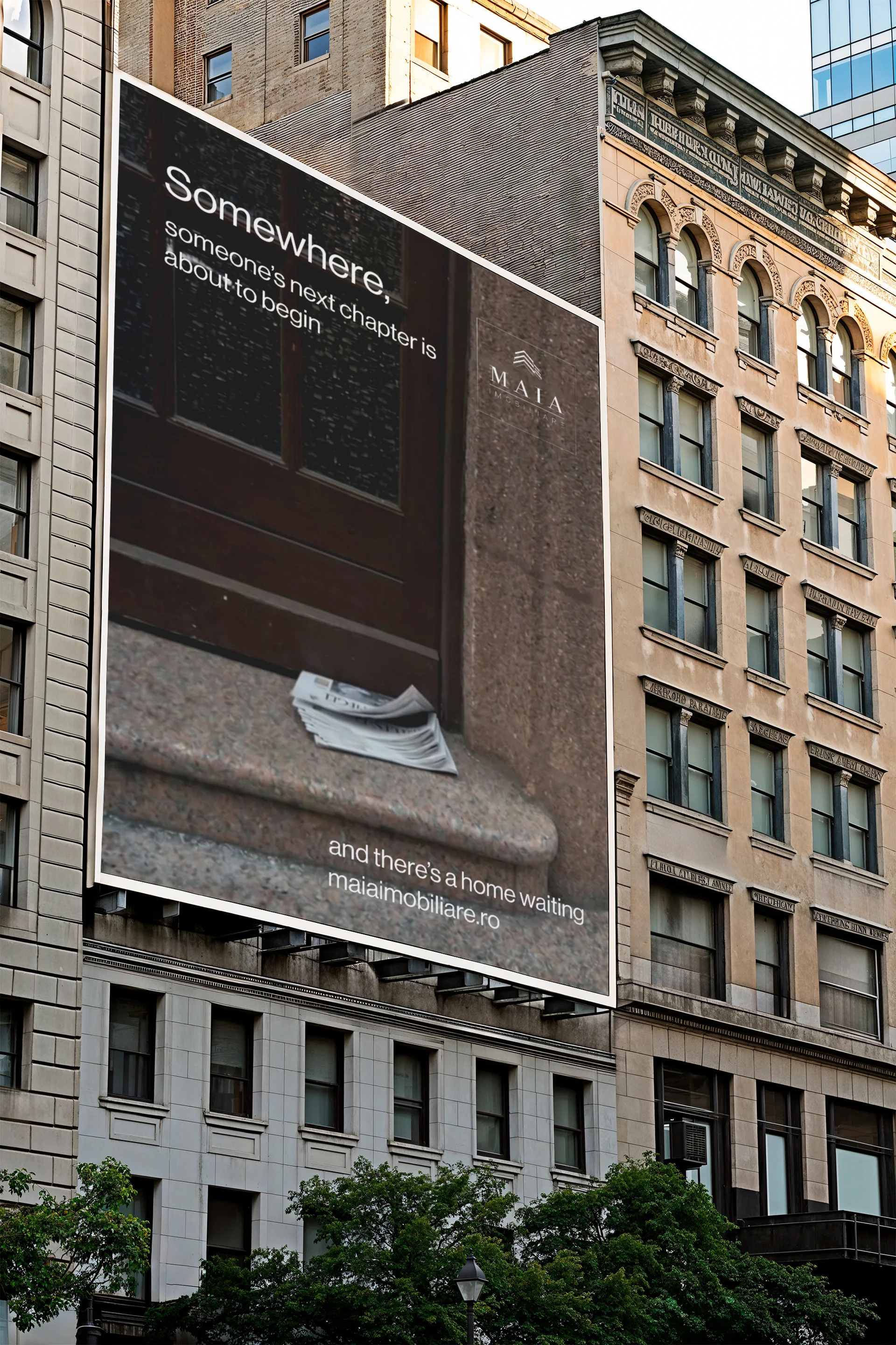
The story sits entirely in what is absent. Someone left. The house is waiting. It is the most restrained execution in the campaign and the one that rewards a second look.
The morning
Somewhere, someone is waiting for mornings like this. A woman carrying pillows across a sunlit room, barefoot on a rug, her face hidden behind the stack.
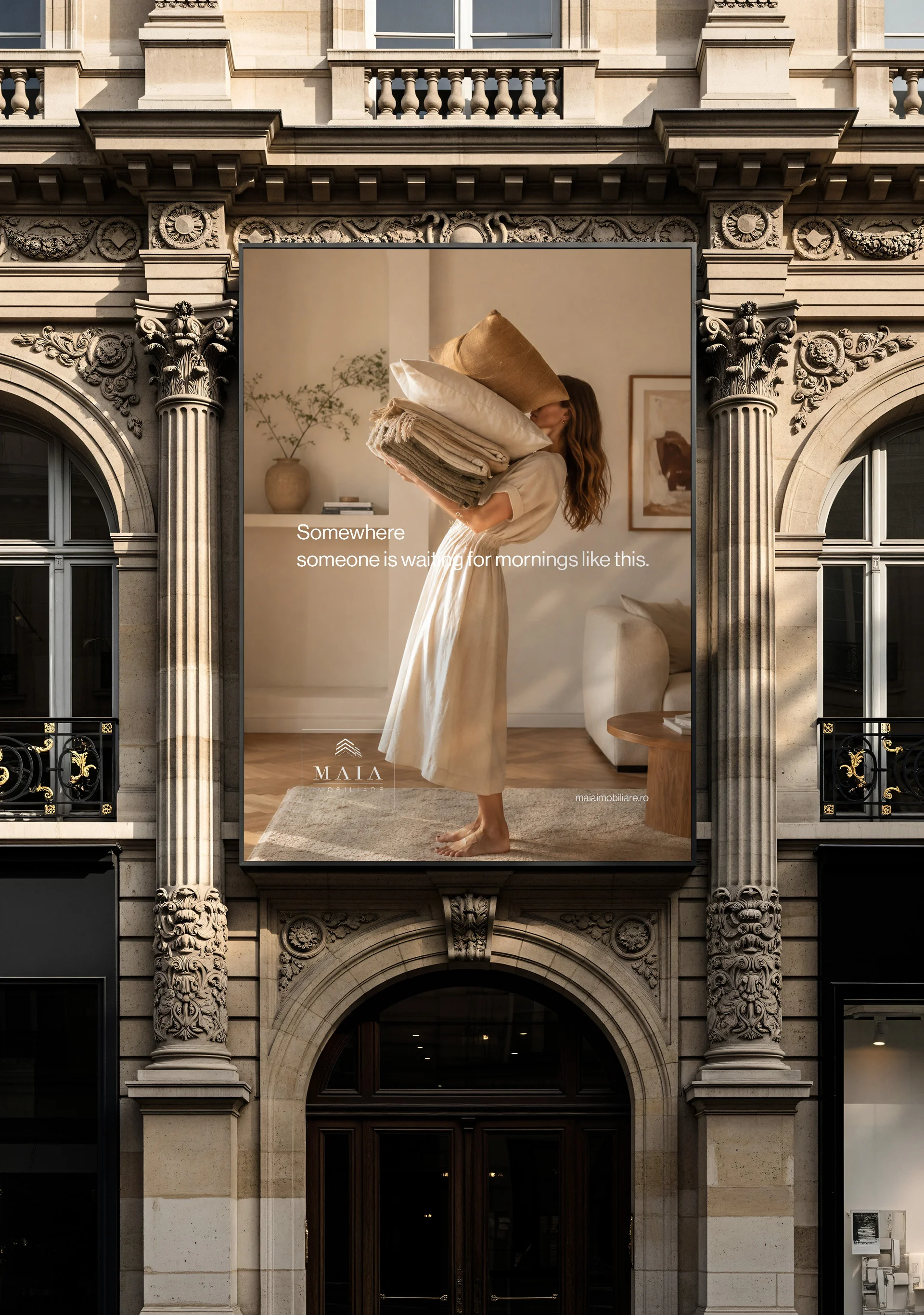
This is the most literal execution and the emotional anchor of the set. It shows the exact moment the campaign is selling, and it gives the more abstract executions a reference point.
Typography and identity application
The Maia identity was applied with restraint throughout. The mark appears small, boxed, and consistently placed, never competing with the image for attention.
Typography stays quiet. A single clean sans in one weight, set at a size that reads at distance without dominating the frame. Line breaks are handled as part of the composition rather than as a text block dropped onto an image, which is why the copy sits differently in every execution while still feeling like one system.
The domain appears once per execution, small, at the point where the eye exits the frame.
The discipline matters commercially. Restraint at this level is what separates a campaign that looks like a brand from one that looks like an advertisement, and it is only possible when the identity system underneath it is solid.
Placement
The campaign was designed for large-format outdoor first, with digital and social extensions built from the same masters.
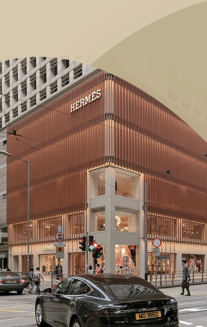
Executions were developed for building wraps, storefront installations, and street-level poster sites in classical architectural settings, where warm interior light contrasts against stone, shadow, and ornament. The environment does part of the work.
Every execution was built to survive the three-second read that outdoor allows, and to reward a longer look from anyone who gives it one.
Why it works
The campaign gives Maia three things the category rarely produces.
Ownership. The Somewhere construction is now associated with one agency in this market. No competitor can adopt it without looking derivative.
Recall. Emotional imagery outlasts specification-led advertising. A keyhole with a dog behind it stays in memory in a way that a floor plan does not.
Extensibility. The system scales into new executions, new formats, and new seasons without a new concept, which protects the investment over time.
Continuity
The brand identity, the website, and the campaign were developed by the same team.
That is why the campaign holds. The typographic system, the restraint, and the tone were already established in the identity work, so the campaign extends the brand rather than interpreting it. When branding, web design, and campaign work sit with separate suppliers, this is exactly the point where consistency breaks.
Creatif Agency handles brand strategy, identity, web design, and campaign design entirely in-house.
Credits
Brand strategy, creative concept, copywriting, art direction, and campaign design by Creatif Agency.
Real estate marketing, told differently.
Client: Maia Imobiliare
Industry: Real estate
Market: Romania
Services: Brand strategy, campaign concept, art direction, copywriting, outdoor and digital campaign design
Relationship: Ongoing since 2024