Back to school, back to reality – Campaign for Sport4all
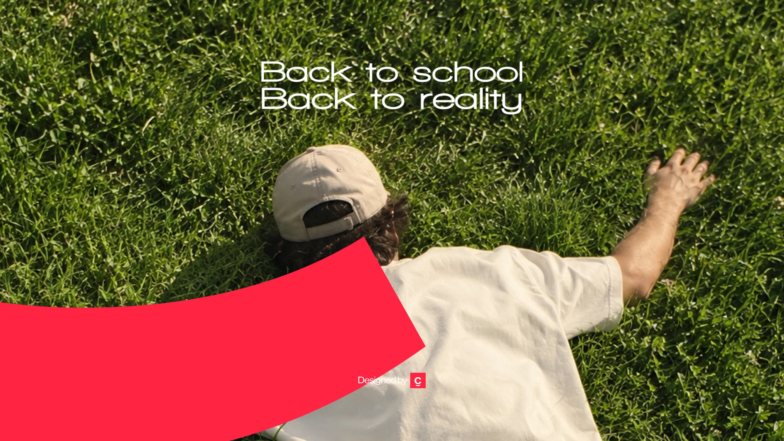
Every back to school campaign sells excitement. Creatif Agency built a fashion marketing campaign for Sport4all around the feeling everyone actually has in September, then turned it into a reason to buy. Back to school. Back to reality.
Sport4all is a multi-brand sportswear retailer carrying 4F, Outhorn, and a portfolio of performance and lifestyle labels. The back to school period is the single most competitive window in the category, and the one where every competitor says the same thing in the same tone.
Creatif Agency built the seasonal brand campaign that says the opposite.

The category problem
Back to school advertising in fashion retail runs on a fixed emotional script. Bright colours. Smiling students. Fresh starts. New year, new you, new backpack.
Every retailer runs it. Every retailer runs it at the same time. The result is a market where the creative is interchangeable, the messaging is identical, and the only variable left is discount depth. When every brand is shouting the same encouragement at the same audience in the same week, none of it registers.
For a multi-brand retailer competing against both direct competitors and the labels it stocks, that is an expensive place to be.
The insight
Nobody is actually excited about going back to school.
Not the students. Not the parents. Not on the first morning, and not for the two weeks before it. Summer ending is a small, universal, unspoken disappointment, and every brand in the category pretends it does not exist.
That gap was the entire opportunity. The one honest emotion in the season was completely unoccupied.
The concept
Two lines carry the campaign:
Back to school. Back to reality.
The first line is what every competitor says. The second is what everyone is actually thinking. The construction works because it sets up a familiar expectation and then undercuts it in three words, which is what makes it funny and what makes it stick.
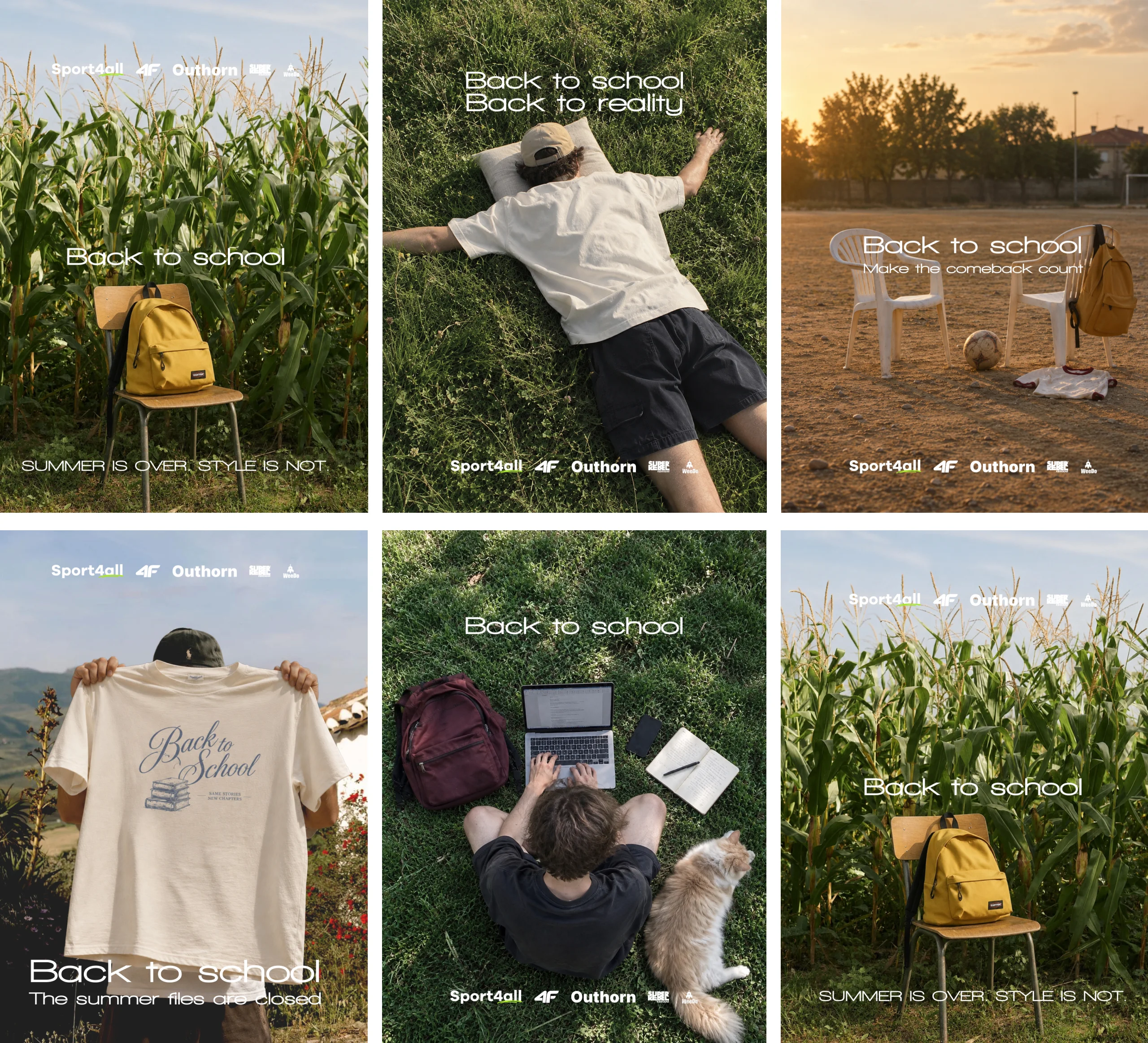
The full copy system extends the same logic: Back to school. Back to reality. Summer is over. Style is not. Back to school. Make the comeback count.
Each line acknowledges the honest feeling first, then pivots into a reason to buy. It never denies the disappointment, which is why the audience trusts the second half of the sentence. The brand is not selling enthusiasm nobody feels. It is selling the thing that makes the return survivable.
The mechanic scales. The opening reference is fixed and instantly recognisable. The completion changes across placements, which keeps repeat exposure interesting across a six week retail window without a new concept.

Art direction
The visual language was built to feel photographic rather than promotional. Golden hour light. Natural settings. No studio backdrops, no smiling models facing camera, no product grids.
The collapse
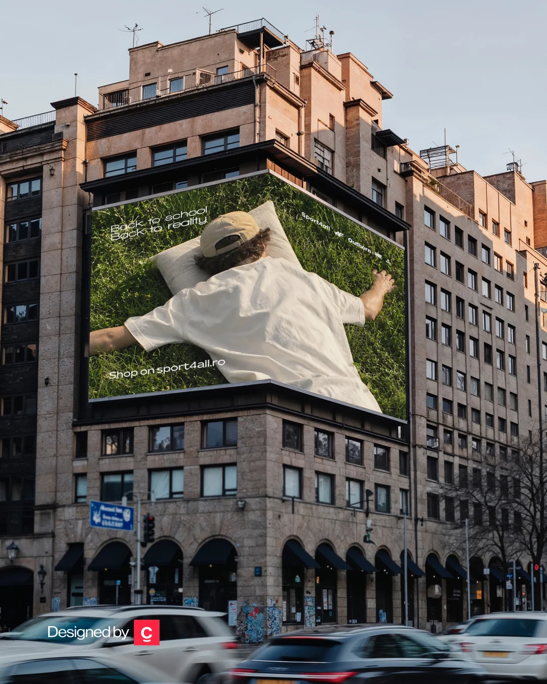
A figure lies face down in tall grass, arms spread, cap still on, entirely motionless.
There is no face, no expression, and no explanation. The posture does all of the work. It is the physical embodiment of the second line, and it reads instantly at any size, in any format, in any language.
This became the hero execution and the anchor of the campaign system. On a storefront installation it stops people because it is the last thing anyone expects to see in a back to school window.
The empty chair
A yellow backpack sits alone on a wooden chair in the middle of a cornfield. Late summer light. Nothing else in frame.
Summer is over. Style is not.
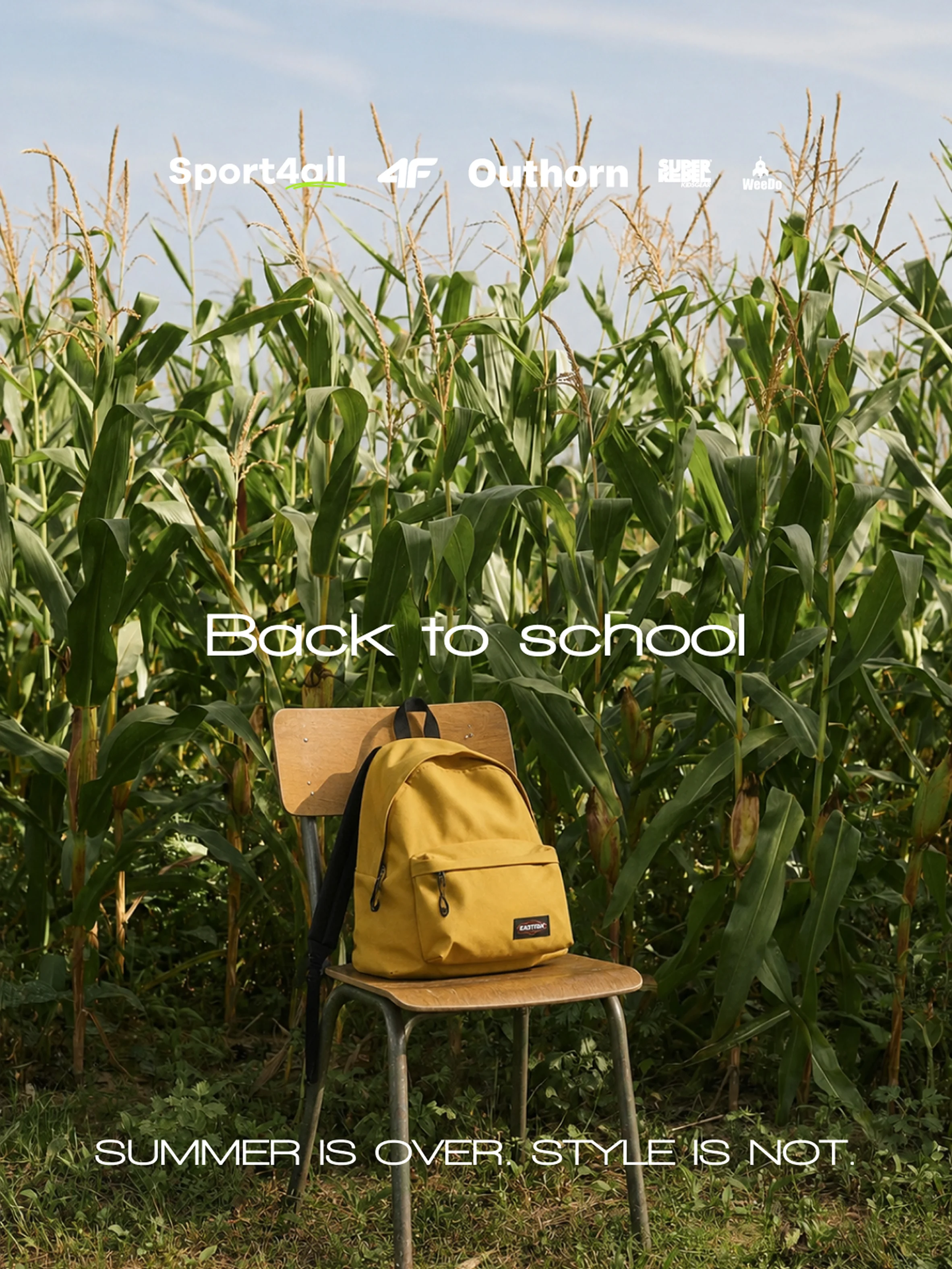
The chair is the school signifier. The cornfield is the summer that is ending. Placing one inside the other communicates the entire tension of the season without a person, a classroom, or a single product shot.
The comeback
Two white chairs and a backpack on a dirt sports pitch at sunset, a football resting nearby.
Back to school. Make the comeback count.
This is the most forward-looking execution in the set and the one that carries the performance side of the Sport4all portfolio. It shifts the tone from resignation to intent without abandoning the honesty the campaign is built on. The comeback framing works because the campaign already admitted there was something to come back from.
The homework
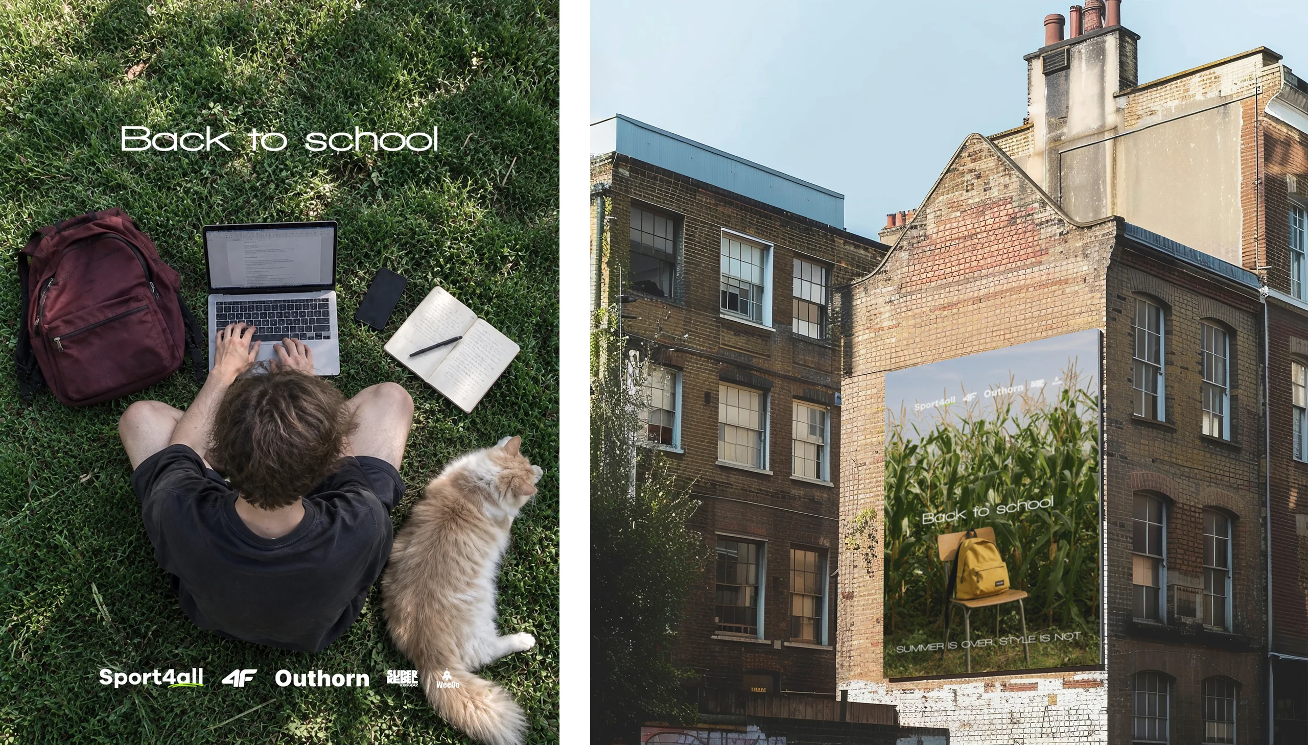
A figure lies flat on grass beside an open laptop, a backpack, and a dog. Face down again, but this time in a domestic setting.
It extends the collapse motif into a second context, which proves the idea is a system rather than a single strong image. It also gives the campaign a warmer, lighter register that prevents the full set from reading as uniformly bleak.
The closed file
Back to school. The summer files are closed.
A figure holds a cream tee up in front of their face, standing in dry sunlit hills. The garment hides them completely.
The tee carries its own line: a script “Back to School” over stacked books, with “same stories, new chapters” underneath. The product is already telling the joke on its own, before the advertising arrives.
The headline shifts register. “The summer files are closed” borrows the language of admin rather than emotion. Summer does not end with a feeling here. It ends the way a work item ends: filed, dated, moved out of the active folder. Nobody asked. The system just updated.
It is the driest execution in the set, and the contrast between the warm holiday landscape and the bureaucratic finality of the line is what makes it land.
Typography and brand application
Typography stays deliberately quiet throughout. A single clean sans, one weight, set in white and positioned to work with the composition rather than dropped onto it.
The multi-brand lockup sits at the base of every execution, small and consistently placed. Sport4all leads, with 4F, Outhorn, and the supporting labels following in a fixed order. This mattered commercially. A multi-brand retailer has to give its stocked labels visibility without letting them dominate the campaign, or the campaign starts working for the labels instead of the retailer.
The restraint is what keeps the brand in control of its own advertising.
Placement
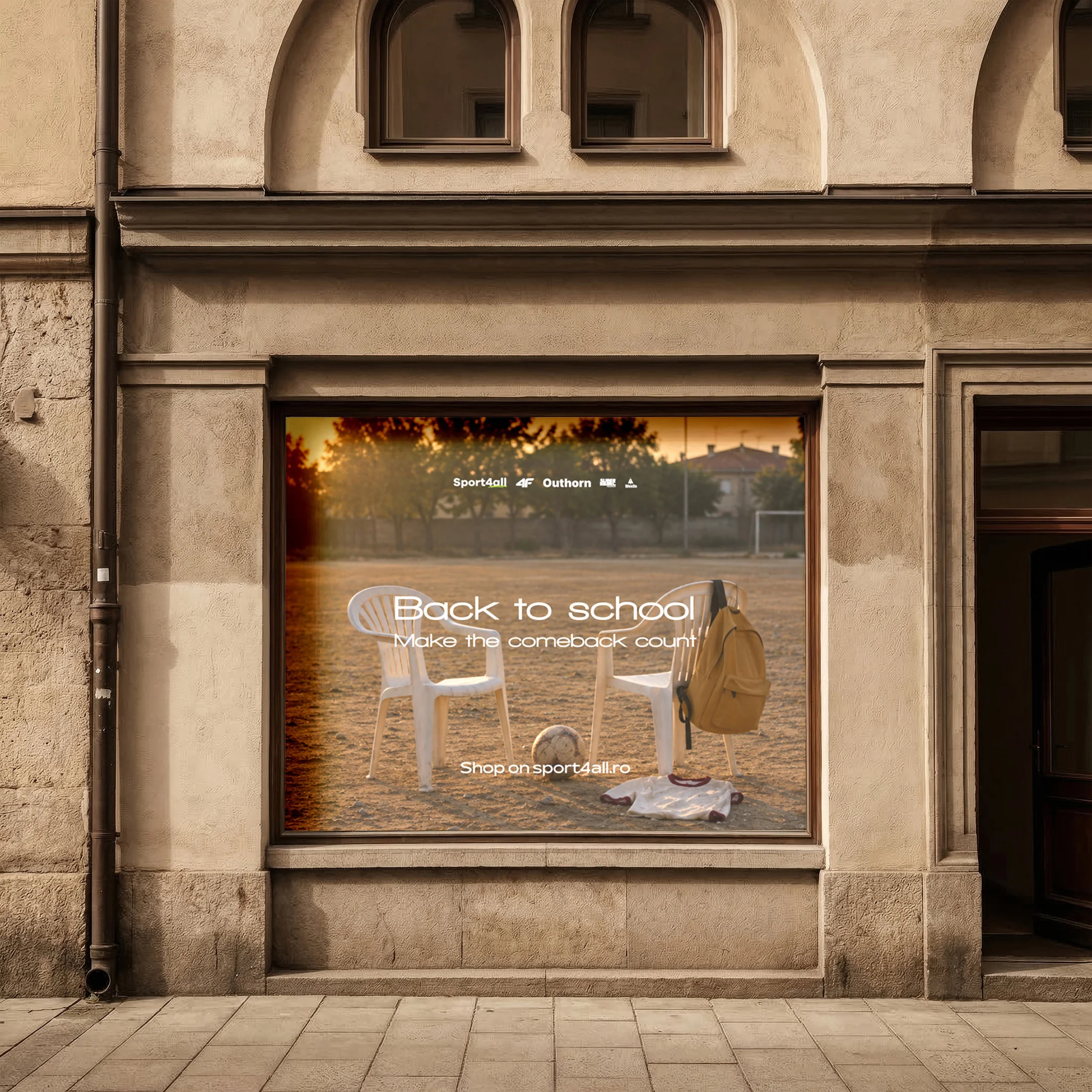
The campaign was designed for storefront and large-format outdoor first, with digital, social, and product extensions built from the same masters.
Executions were developed for shop window installations, building wraps, and street-level placements. Product applications extend the campaign onto apparel itself, closing the loop between the advertising and the item on the shelf.
Every execution was built to survive a three second read and to reward a longer look from anyone who gives it one.
Why it works
Honesty as differentiation. In a category built on manufactured enthusiasm, the brand that says the true thing is the only one anyone hears.
Humour that earns attention. The joke is shared, not made at anyone’s expense. The audience is in on it, which builds affinity rather than just recall.
Recall. A person lying face down in a field stays in memory. A smiling student holding a backpack does not.
Extensibility. The construction scales into new executions and new seasons without a new concept, which protects the investment across future retail windows.
Continuity
The strategy, the copy, the art direction, and the campaign design were developed by the same team.
That is why the tone holds across every execution. When the concept, the writing, and the visual work sit with separate suppliers, the humour dies somewhere in the handover and what survives is a joke nobody commits to. Creatif Agency handles brand strategy, identity, web design, and campaign design entirely in-house.
Credits
Brand strategy, creative concept, copywriting, art direction, and campaign design by Creatif Agency for Sport4all.
Fashion marketing, told honestly.
Client: Sport4all
Industry: Sportswear and fashion retail
Market: Romania
Services: Campaign concept, art direction, copywriting, storefront and outdoor campaign design, social and product applications.