20 Creative Branding Design Ideas to Inspire Your Next Project
Creative branding design is at the heart of any successful business. Whether you’re launching a new brand or rebranding an existing one, a fresh approach to design can set you apart from competitors. In this article, we’ll explore 20 innovative branding design ideas to inspire your next project and help you create a memorable brand identity.
Branding inspiration
1. Minimalist Design with a Strong Focus on Typography
Minimalist branding, paired with strong, clean typography, is a timeless trend. It allows your brand message to shine by removing unnecessary elements, focusing instead on clear fonts, negative space, and simplicity. Brands like Apple have used this to create powerful identities.
2. Using Illustrations to Tell Your Brand Story
Custom illustrations can give your brand a unique and personal touch. Hand-drawn elements or digital artwork can represent your brand’s personality in a way that stock photos or traditional images cannot. It’s especially useful for brands aiming for a fun, approachable aesthetic.
3. Vintage-Inspired Branding for a Nostalgic Appeal
Vintage branding taps into a sense of nostalgia, evoking emotional connections with audiences. This design style uses retro fonts, color palettes, and textures to create a look that feels both classic and familiar. Brands like Coca-Cola have utilized vintage themes to reinforce their heritage.
4. Geometric Shapes and Patterns for Modern Aesthetic
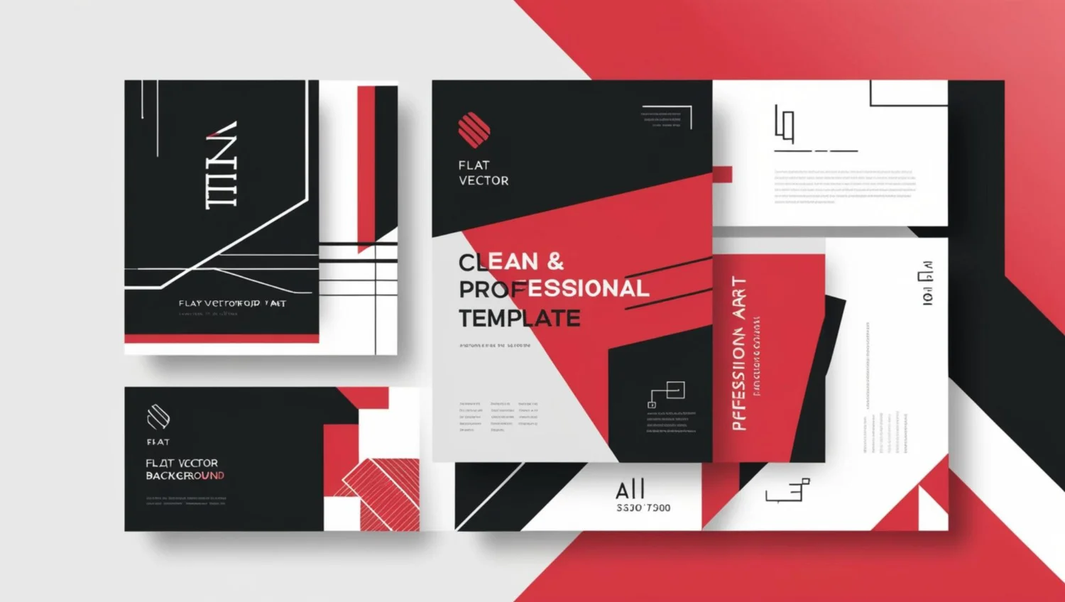
Geometric shapes and bold patterns offer a sleek, modern approach to branding. Clean lines, symmetrical designs, and angular elements give a cutting-edge vibe, perfect for tech startups and innovative companies looking to establish themselves as forward-thinking.
5. Color Gradients for a Dynamic and Engaging Look
Gradients add depth and dimension to brand visuals, making them more engaging and vibrant. This trend has seen a resurgence, especially in digital-first companies where dynamic visuals are essential. Brands like Instagram have successfully embraced gradient color schemes in their identity.
6. Eco-Friendly Design for Sustainability-Focused Brands
Sustainability is more than just a buzzword—it’s a core value for many businesses. Using natural, earthy tones, recycled materials, and simple, eco-friendly packaging reflects this commitment. Brands like Patagonia excel in this space, linking their branding to their sustainability ethos.
7. Interactive Branding Elements
Interactive branding, such as packaging that involves a tactile or immersive experience, can create memorable moments for consumers. QR codes, hidden messages, or packaging that transforms into something useful can engage customers beyond the initial purchase.
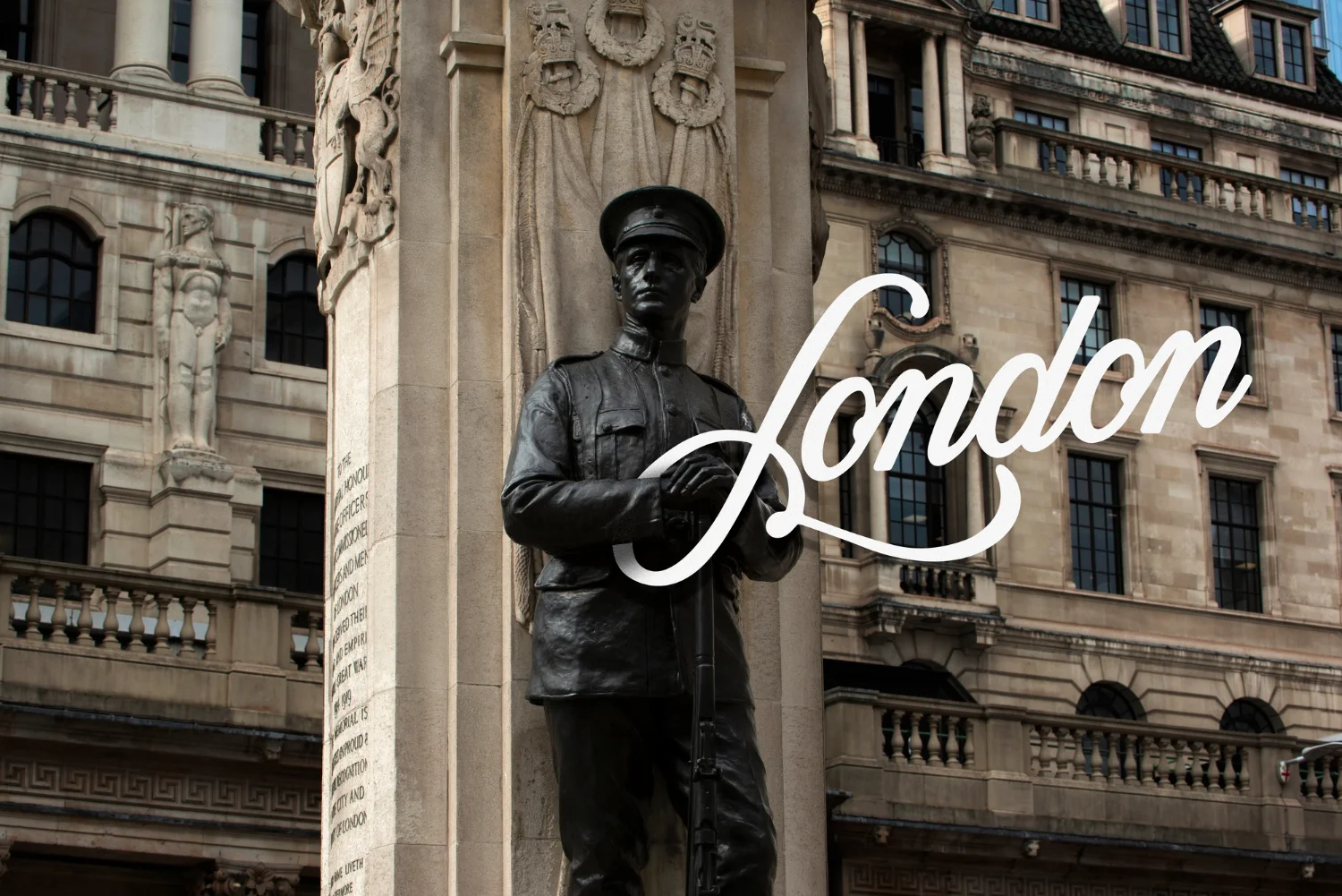
8. Handwritten Fonts for a Personal Touch
Handwritten fonts convey warmth, authenticity, and personal connection. This style works well for lifestyle brands, artisan products, and personal services where the customer experience is intimate and personal. Brands like Innocent Drinks use this style to maintain a friendly tone.
9. Monochromatic Branding for a Sleek, Cohesive Look
A monochromatic color scheme adds elegance and sophistication to any brand. By focusing on one color family, brands can create a cohesive visual identity. This approach works well for luxury goods, fashion, or any brand wanting to project a sleek and high-end image.
10. Bold and Vibrant Color Combinations
On the opposite end of the spectrum, bold and vibrant color combinations can make your brand stand out in a crowded market. Think of brands like Red Bull or Fanta, where bright colors play a key role in creating a youthful, energetic image.
11. Transparent Packaging for Product-Driven Brands
Transparent or minimalistic packaging highlights the product itself, which is ideal for businesses proud of their quality. This strategy works particularly well for organic food brands or skincare companies that want to emphasize purity and transparency.
12. Modular Logos for Versatility
A modular logo can adapt across multiple platforms and uses. This design approach allows brands to use different variations of their logo depending on the application, ensuring consistency while maintaining flexibility. Google’s logo is a classic example of this adaptability.
13. 3D Elements for a Modern Edge
3D design is becoming increasingly popular in branding as it adds depth and realism to logos and visuals. By integrating 3D elements, brands can stand out on both digital and physical platforms, offering a more engaging experience.
14. Luxe Textures and Metallic Finishes
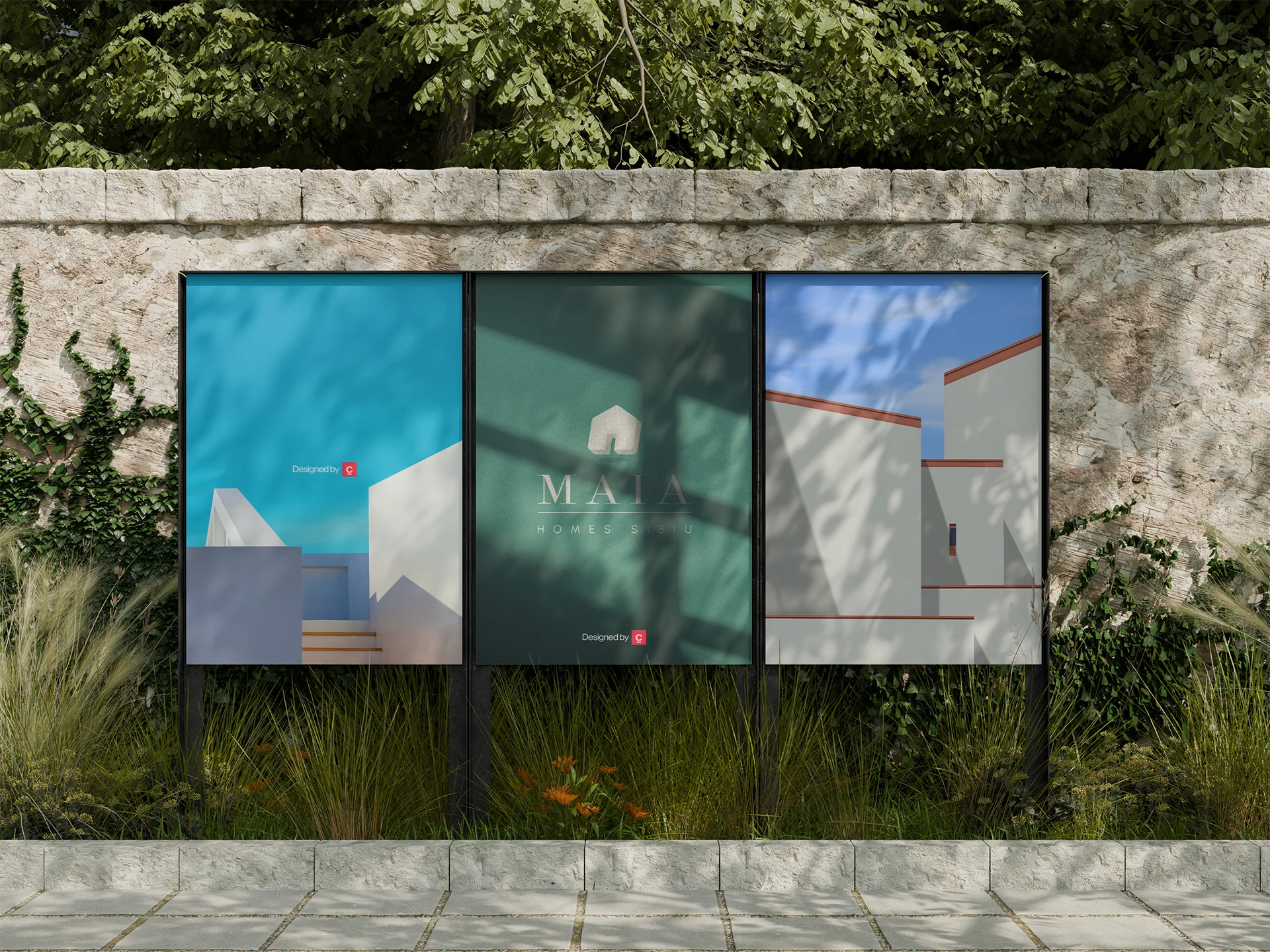
For luxury brands, incorporating textured materials and metallic finishes into branding—like foil stamping or embossed packaging—exudes high-end appeal. This adds a tactile element that consumers associate with quality and prestige.
15. Custom Iconography for a Cohesive Brand Language
Custom icons enhance visual storytelling by creating a unique, easily recognizable brand language. These icons can be used across websites, apps, and marketing materials, providing a seamless and consistent experience for users.
16. Asymmetrical Layouts for Unique Brand Appeal
Stepping away from traditional grid layouts, asymmetrical designs offer a fresh take on branding that breaks the mold. It’s an excellent way for creative agencies or artistic brands to showcase their originality and thinking outside the box.
17. Animated Logos for Digital Branding
Animated logos are highly engaging and ideal for brands that have a significant online presence. An animated element can be integrated into websites, videos, and social media, adding an extra layer of interaction and personality.
18. Negative Space in Logo Design
Using negative space creatively within logos can add depth and hidden meaning. It’s a subtle yet powerful tool that offers a clever twist in branding. Brands like FedEx and WWF have used negative space to craft clever, memorable logos.
19. Seasonal or Limited-Edition Branding
Consider creating seasonal or limited-edition designs to keep your branding fresh and engaging. This approach can generate excitement and create urgency among customers. Coca-Cola’s holiday packaging is a prime example of seasonal branding done right.
20. Collage-Style Branding for Eclectic Appeal
Collage branding uses a mix of photography, illustrations, and typography to create a visually rich and eclectic brand identity. This approach is great for brands that thrive on creativity, offering a playful and artistic aesthetic.
Conclusion: Fresh Ideas for a Powerful Brand Identity
Crafting a memorable brand requires innovation, creativity, and a deep understanding of your audience. By exploring these 20 creative branding design ideas, you’ll be better equipped to develop a brand identity that not only resonates with your audience but also elevates your business above the competition. Whether you’re looking for a sleek, minimalist design or a bold, vibrant look, the right approach to branding can make all the difference.

