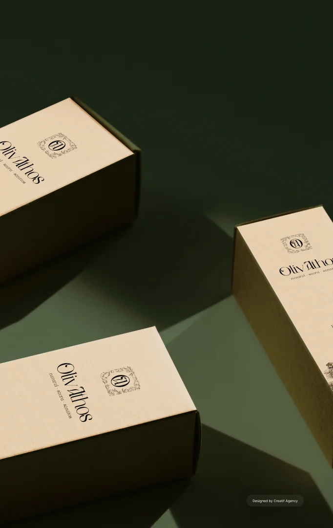
OlivAthos came to Creatif because they wanted more than a website refresh. They wanted a premium brand presence that feels timeless, controlled, and instantly recognizable across every customer touchpoint. Olive oil is a category filled with loud claims and template stores, so the opportunity was to win through restraint and credibility. We delivered a brand led ecommerce experience that blends editorial storytelling with a clean buying journey. The final result is a dark, elegant visual system paired with a high converting layout structure. Every screen is designed to feel like a premium label, not a generic shop.
Why OlivAthos Chose Creatif
OlivAthos preferred Creatif because we handle branding and bespoke web design in house, so the work stays consistent from strategy to execution. They did not want a brand created by one team and a website interpreted by another team later. That split usually introduces compromises, visual drift, and weak storytelling. Instead, they wanted one partner that can define the brand foundations, then translate them into a premium digital experience without losing intent. Our process gave them a single direction, a single quality bar, and a single team responsible for everything the customer sees. That is what premium brands need, because consistency is the product before the product.
The Challenge
The website had to sell premium olive oil and olives while communicating provenance and quality in seconds. The client wanted to avoid typical ecommerce patterns that feel crowded, promotional, and disposable. They also wanted the experience to feel calm, healthy, and sacred, because those values match the brand story and the sourcing narrative. At the same time, the site still needed clear product selection, clear shipping information, and a checkout path that feels effortless. Our challenge was to hold two truths together, because premium brands require emotion and performance in the same interface.
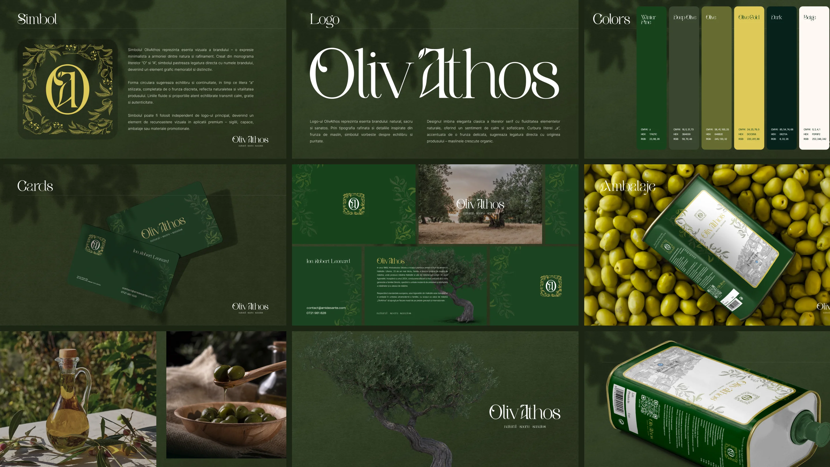
Branding Direction A Visual Identity Built For Trust And Desire
Branding was central to the project, because OlivAthos needed a system that can live across packaging, photography, digital, and future campaigns. We shaped a premium brand language that feels natural and sacred, using typography, spacing, and tone to communicate confidence without over explaining. The identity direction favors quiet luxury, with a restrained palette and a strong editorial hierarchy that makes every message feel curated. This approach elevates the perceived value of the product and makes the customer journey feel intentional. It also gives OlivAthos a consistent brand foundation, so future products and content can expand without losing recognition.
Our Web Design Strategy
We designed the website like an editorial story that guides the visitor toward a purchase decision. The layout uses deliberate pacing, with strong hero imagery, short emotional statements, and supportive sections that add credibility. We avoided clutter, heavy icon sets, and overly complex navigation, because premium experiences rely on clarity and air. We also used repeated brand moments across the site, so the customer sees the same quality signals on every page. The goal was to make OlivAthos feel instantly premium, then keep the purchase process intuitive and fast.
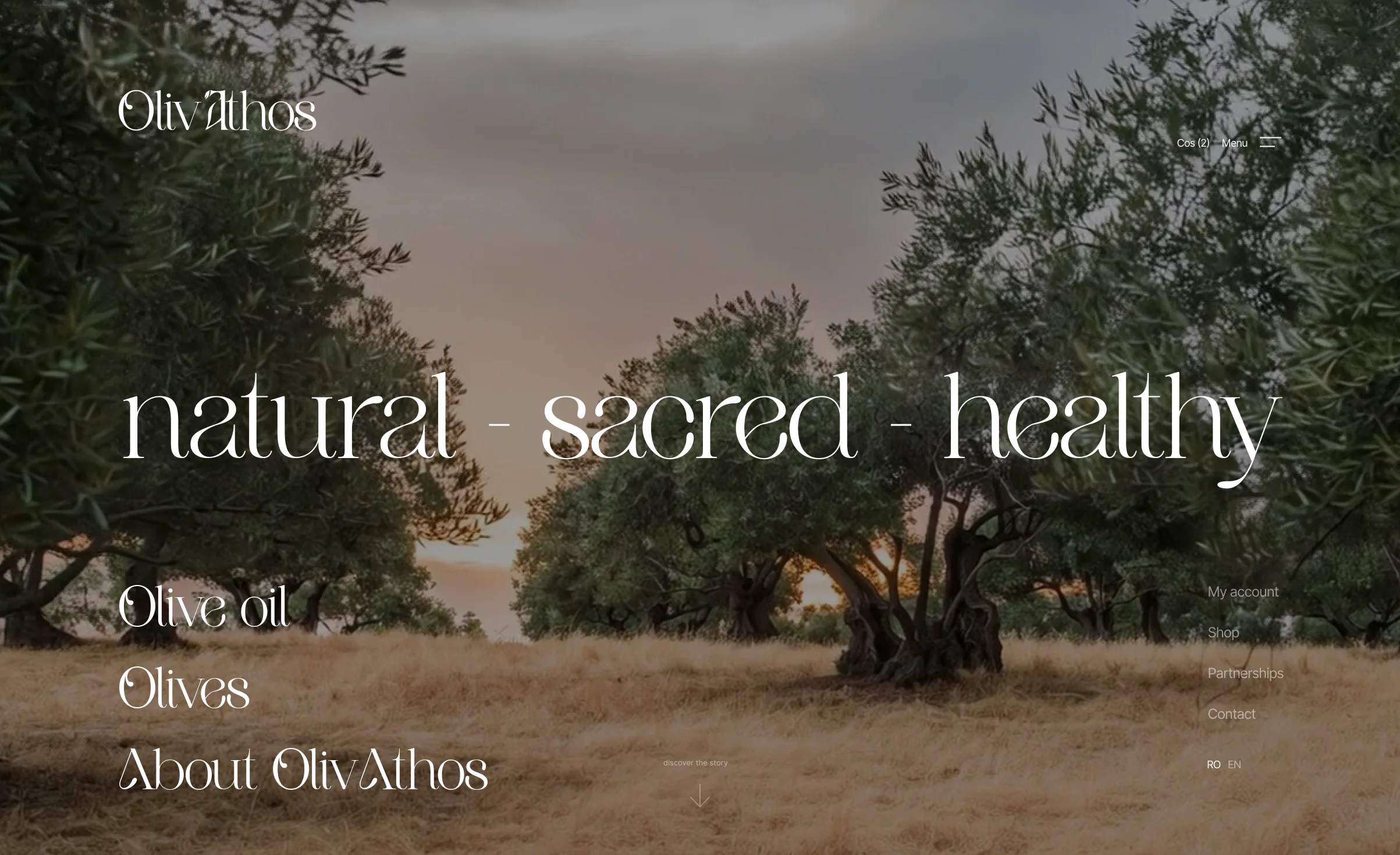
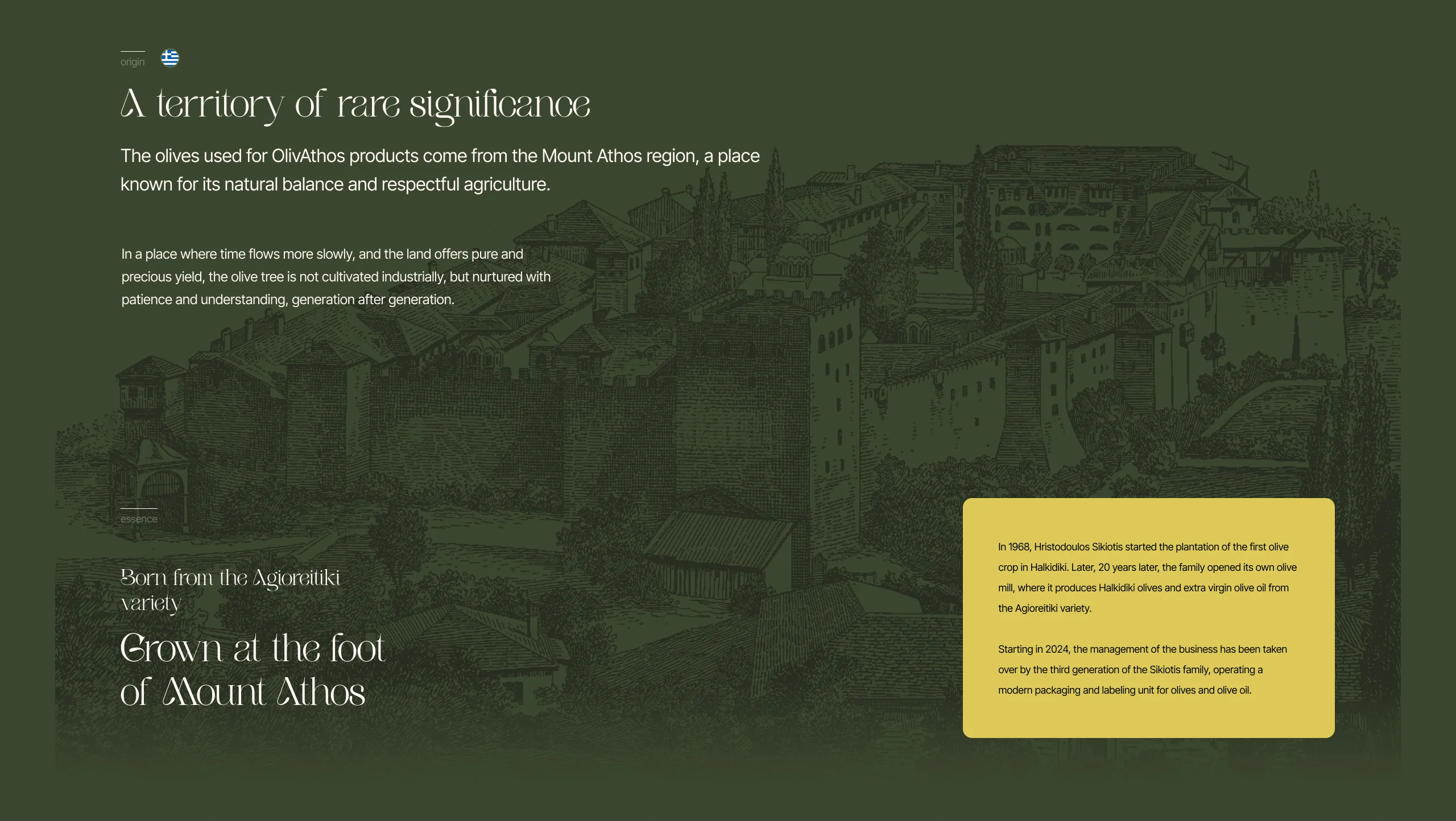
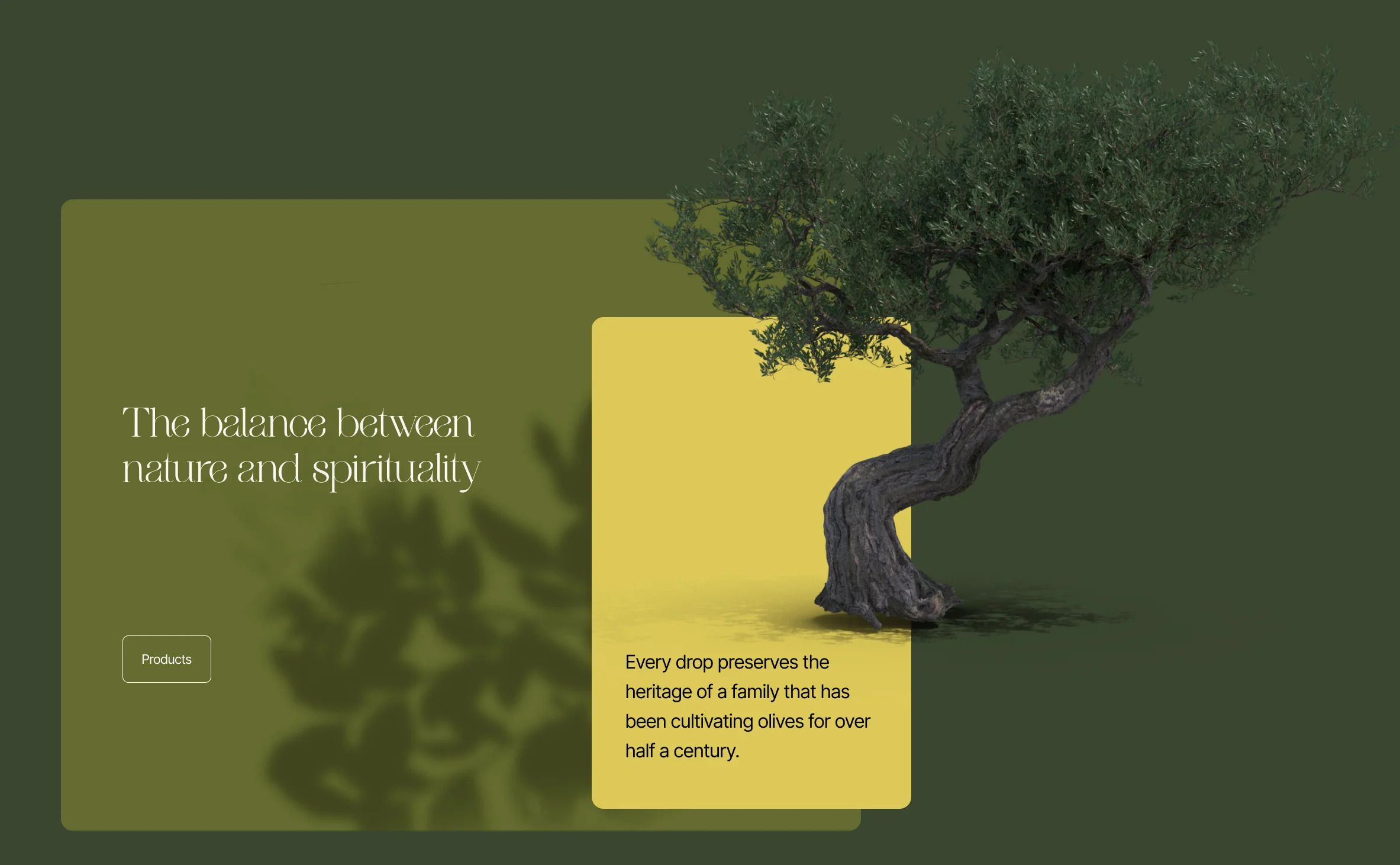
Homepage Experience First Impression That Feels Like A Premium Label
The homepage introduces OlivAthos with a strong visual mood and minimal copy, because the design must carry the emotion. We used a hero section that feels cinematic and calm, then positioned the key value words as a brand statement rather than marketing noise. The rest of the page is structured as a sequence of credibility, story, and product entry points. Visitors can browse without feeling pushed, yet the site always keeps the next action obvious. This approach increases trust, because it respects the visitor’s attention and creates a boutique feeling.
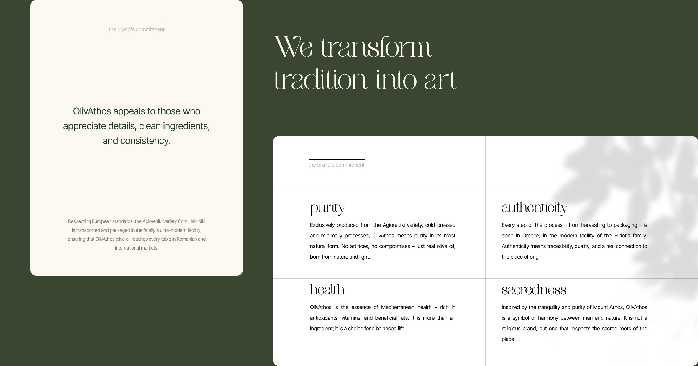
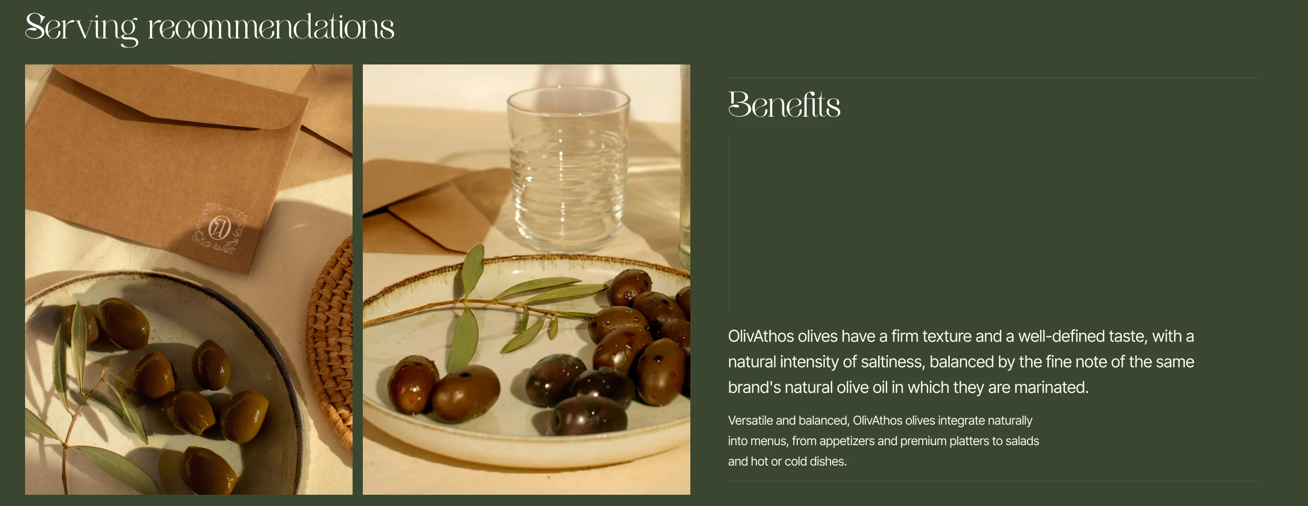
Storytelling Sections Heritage Without Noise
OlivAthos needed a story that feels authentic, not written like a brochure. We built sections that communicate heritage, sourcing, and ritual through concise statements supported by imagery and typography. The layout style resembles a magazine, with feature blocks that feel collectible and premium. This creates emotional context for the product, which is critical in categories where customers cannot taste before buying. The story sections also act as trust scaffolding, because they explain quality through design discipline.
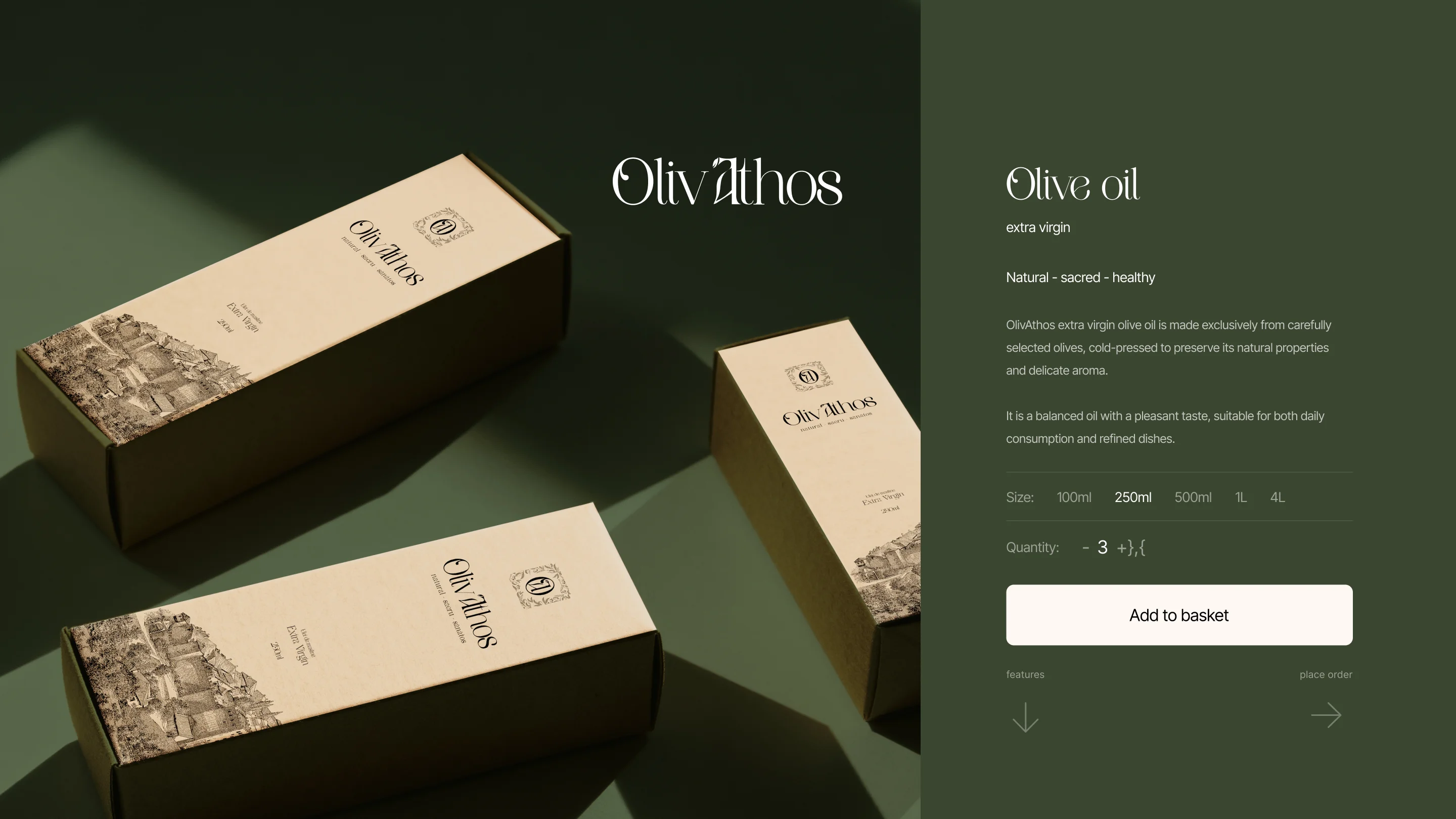
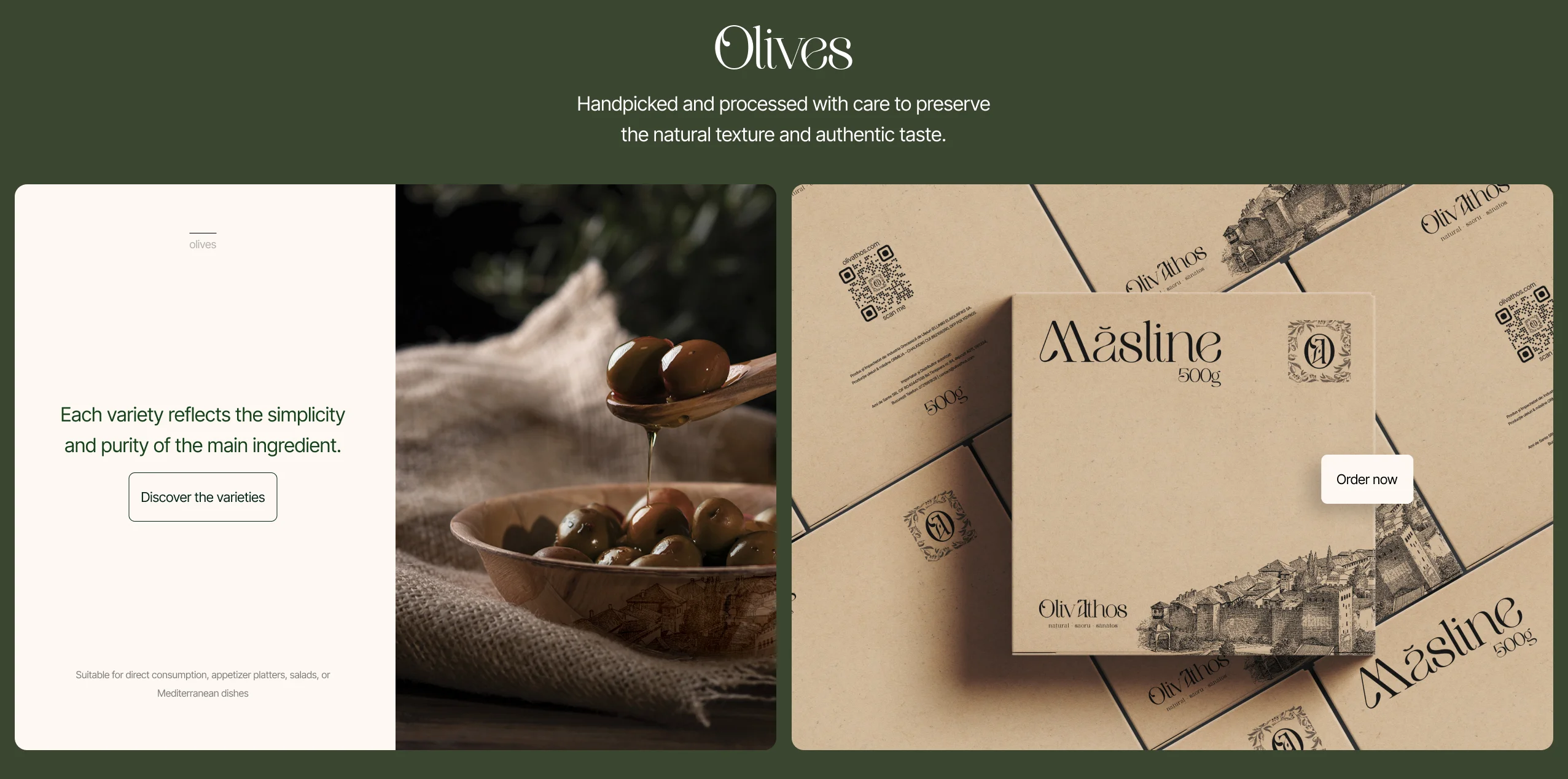
Product Discovery Clean Catalog Cards And Focused Choices
The product area avoids the typical grid that overwhelms customers with options and badges. Instead, we framed products in a refined, minimal presentation that highlights the object and its details. This makes each item feel curated, which increases perceived value and reduces decision fatigue. We also designed the hierarchy so the visitor always knows what they are looking at, what it is for, and how to buy it. Premium ecommerce is not about showing more, it is about helping the customer choose with confidence.
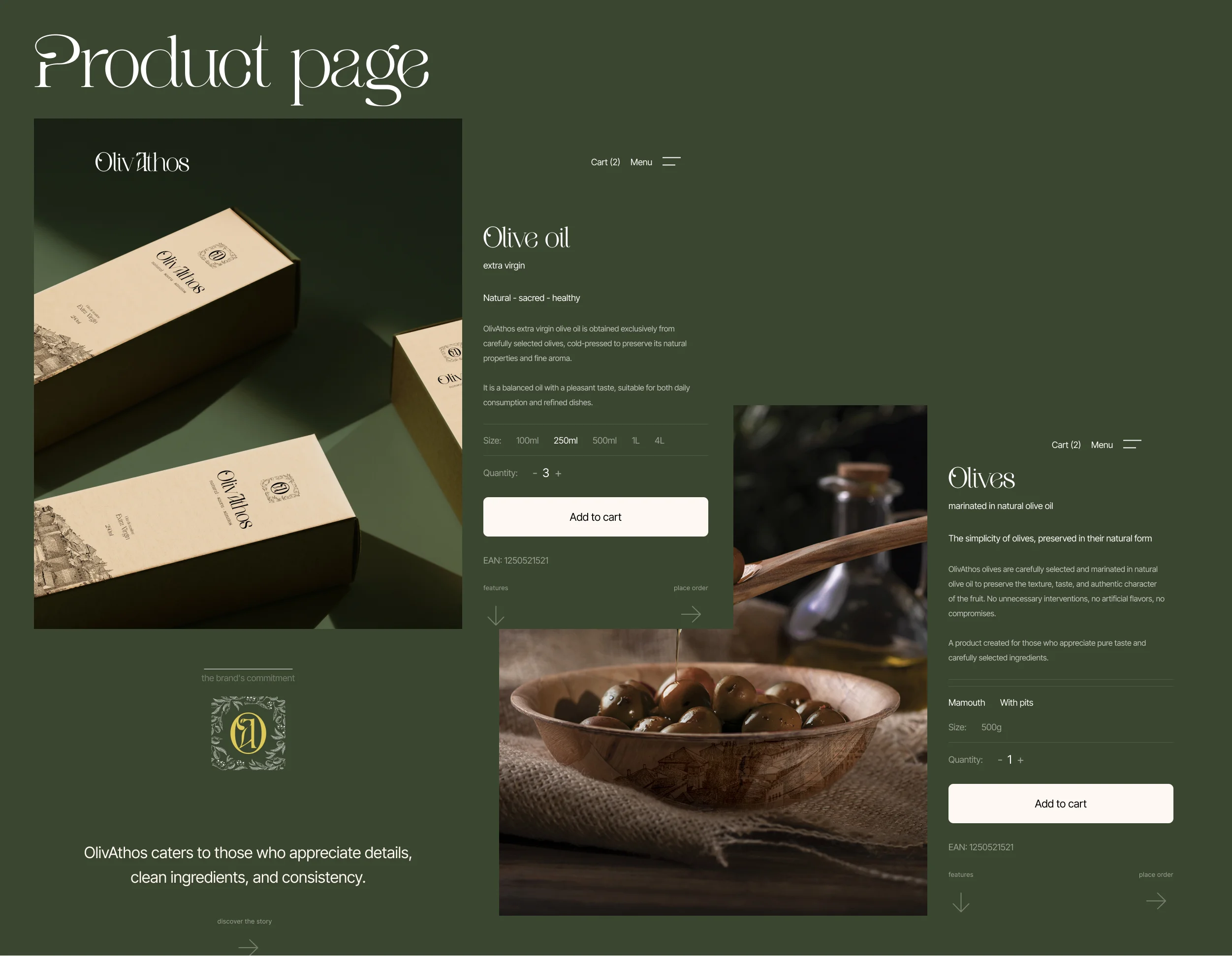
Product Page A Boutique Buying Experience
The product page is built around clarity and reassurance, because that is what increases conversion for premium items. We kept the layout structured, with a clear product title, clean price placement, and a purchase action that stands out without feeling aggressive. Supporting content appears in the right order, with story, ingredients, usage, and shipping details where the customer expects them. The imagery reinforces texture and authenticity, so the product feels real and desirable. The page design supports upsells subtly, through complementary items and story cues rather than hard selling.
Conversion Design Checkout That Feels Effortless
We designed the purchase path to be calm and predictable, because customers abandon when the experience becomes uncertain. Forms, buttons, and microcopy are kept minimal and consistent, so the user never needs to think twice. We also emphasized shipping and policy clarity, because those are major trust triggers in ecommerce. The visual system stays consistent through the funnel, which protects the premium feeling until the final step. This matters because a premium brand loses value when checkout looks generic.
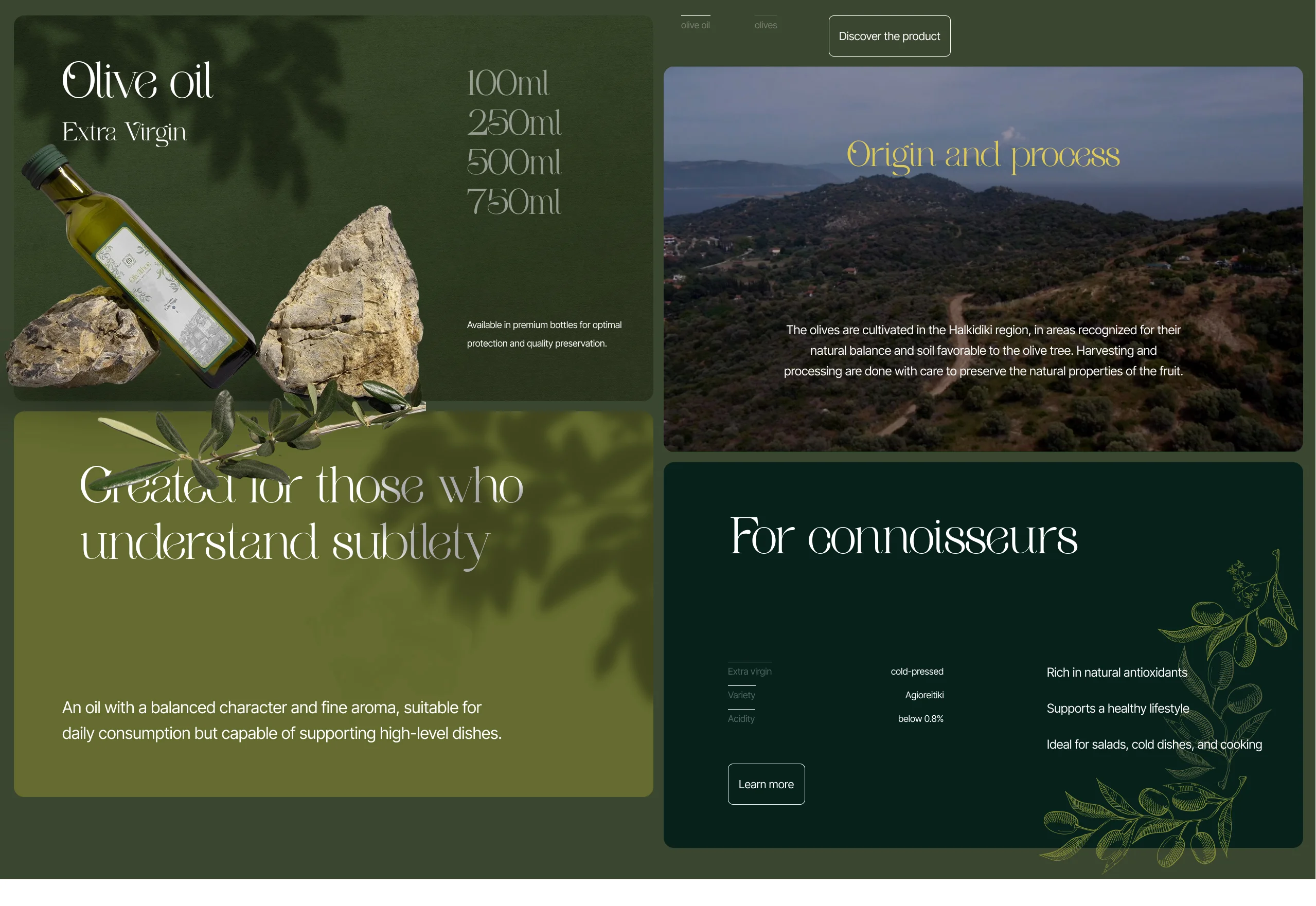
Visual Design System Dark Elegance With Strong Typographic Hierarchy
The visual direction uses a deep, earthy background tone paired with warm, premium accent elements. This creates a gallery like environment that makes photography and typography feel expensive. We used large type moments for emotional brand statements, then smaller type for factual details and product information. Spacing is generous, which increases readability and gives the site a composed presence. The overall system is built to scale, so new pages and products can be added without breaking consistency.
What Makes This Project Stand Out
OlivAthos is a good example of how branding and bespoke web design should work together as one system. The website does not rely on trends or effects to feel premium, because the foundation is a strong identity and disciplined layout decisions. The brand story is not separated from conversion, it is the conversion. The design results are distinctive in the category, which is exactly what creates recognition and long term value. This is the kind of ecommerce experience that turns a first order into a repeat customer relationship.
Deliverables
Brand direction and visual language for digital use Typography hierarchy and layout principles Premium color palette and styling system Homepage design with editorial storytelling modules Ecommerce product listing design Product page design with clear purchase hierarchy Page templates for shipping, terms, and contact UI components for buttons, forms, and content blocks Responsive design direction for mobile and desktop
Closing
OlivAthos needed a premium brand presence and a store experience that feels calm, credible, and timeless. Creatif delivered a cohesive branding led ecommerce design that makes the product feel valuable before the first click. The final website balances storytelling and conversion through disciplined art direction and a clear UX structure.
If you want a brand and website that feels truly bespoke, built by one team with one quality bar, Creatif is the partner that delivers that standard.