The Challenge: Creating a Unique and Scalable Security Brand
Bakvakt, an Icelandic security solutions startup, was founded by three seasoned technicians with over 30 years of experience in the industry. Their expertise spans fire alarm systems, surveillance, and advanced security technology. With a focus on distributing and installing products like BlazeCut, iLOQ, and Reolink cameras, Bakvakt aimed to position itself as a trusted name in the Icelandic security market.
However, as a newly established company, Bakvakt needed a cohesive and professional brand identity that would reflect its technical expertise, reliability, and forward-thinking approach. They required a brand that could encapsulate their commitment to safety while remaining flexible enough to accommodate future growth.

Our Approach: Developing a Professional and Scalable Identity
We worked closely with the Bakvakt team to craft a distinctive and meaningful brand identity. The goal was to develop a strong visual language that embodied security, vigilance, and technological sophistication. Our approach focused on several key elements:
Logo Design
The Bakvakt logo system was designed for flexibility and scalability. We developed multiple versions to ensure usability across different platforms and surfaces:
Square Logo – Ideal for stickers, badges, and compact placements where the full text logo isn’t suitable.
Symbol Logo – A minimalist version used for very small placements such as mobile applications and badges.
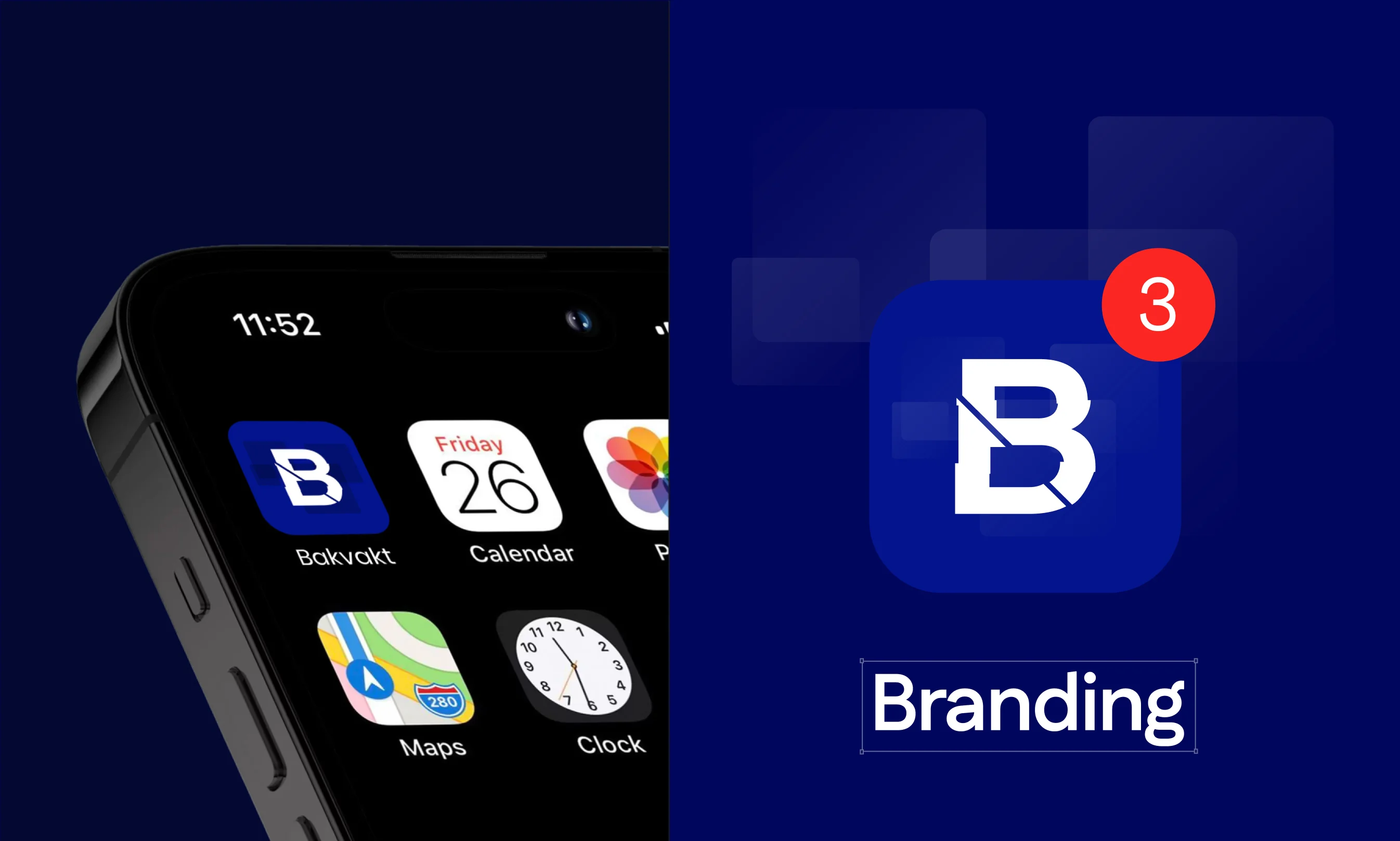
App Icon – Featuring Bakvakt’s signature “B” combined with the primary blue and the shield pattern, ensuring high visibility and brand recognition.
Inline Logo – A combination of the B icon and text logo, suitable for website headers, long outdoor banners, and other extended placements.
Symbolism Behind the Design
We integrated meaningful elements into the logo to reinforce Bakvakt’s brand identity:
![]()
Flicker Effect
Inspired by CCTV and surveillance technology, representing constant monitoring.
Shields
A direct representation of security and protection.

Main shields – a group of 4 shields with a gradient that can be colored in any brand color, ligher or darker. Those shields are used for highlighting the brand message.
Circuit Patterns
Symbolizing advanced technology and the interconnectedness of security systems.
The circuits – used only on solid color backgrounds, the circuits can be placed on any corner of the screen in order to provide a better aspect of the overall design. The circuits should ALWAYS be colored on a darker color than the background one.
Brand Elements & Visual Assets
Beyond the logo, we developed a comprehensive set of brand elements to create a cohesive identity across all touchpoints:
- Shield Graphics – A set of four gradient shields used to highlight key brand messages.
- Circuit Patterns – Designed for solid color backgrounds, enhancing the overall aesthetic while reinforcing the brand’s technological aspect.
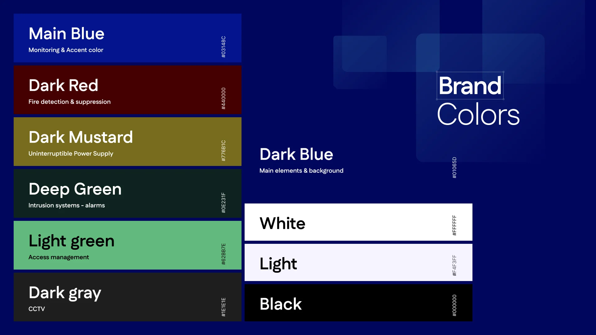
Color Palette & Typography
To create a professional and modern feel, we selected a primary color palette of blue and white, reflecting trust and clarity. The typography was chosen to complement the brand’s clean and modern look while ensuring readability across different materials.
Brand Application
With the branding foundation in place, we extended Bakvakt’s identity across various digital and print applications:
- Digital & Print Billboards – Ensuring strong visibility for marketing campaigns.
- Badges & Packaging – Reinforcing brand recognition across physical products.
Social Media & Documents
- Social Media Templates: Professionally designed templates to maintain a uniform online presence.
- Official Documents: Branded letterheads and templates for internal and client communications.
The Outcome: A Strong Foundation for Growth
Through strategic design and thoughtful branding, Bakvakt now has a powerful visual identity that aligns with its mission and expertise. The new branding positions the company as a professional, trustworthy, and innovative player in the Icelandic security industry. As Bakvakt continues to expand its services, the brand identity will serve as a strong foundation for building recognition and credibility.
Looking Ahead
With the branding phase successfully completed, the next step in Bakvakt’s journey is the launch of its website, designed to further strengthen its online presence and customer engagement. Stay tuned for the upcoming release!
Need a powerful brand identity for your business?
At Creatif Agency we specialize in building standout & timeless brands, that drive success. Contact us today to start designing your brand identity and establish your presence in the market.