Productivity – Industrial Branding Reimagined by Creatif Agency
A.I. OverviewCreatif Agency partnered with Productivity, a new industrial brand from Romania, to create a complete visual identity and one-page website. Built around the principles of precision, strength, and modernism, the project combines bold typography, engineered symbolism, and digital clarity. From the logotypes and CNC-inspired icon to the dynamic motion lines and Volt Yellow highlights, every element was designed to express technical excellence and forward-thinking design — a brand system engineered for performance.
Productivity is a Romanian industrial brand focused on CNC tools, carbide manufacturing, and recycling technologies. When they approached Creatif Agency, the goal was clear: to build a brand that reflects accuracy, engineering power, and modern aesthetics. Our task was to create a complete identity — from brand strategy and visual direction to a fully functional one-page website — capable of standing confidently among leading European industrial names.
Project Services
Branding and Visual Identity | UX & UI Design | Custom Web Development

Location: Romania
A Brand Built on Engineering, Precision, and Progress
The entire concept behind Productivity was inspired by the mechanics of creation — where every detail, rotation, and cut matters. At Creatif, we approached the project as a system of precision. The brand needed to communicate measurable performance and technical expertise while remaining visually elegant and contemporary. We translated these ideas into a design language where engineering accuracy meets visual clarity.
Our strategic direction revolved around three key ideas — Precision, Industrial force, and Modernism. These became the pillars of the identity and guided every creative decision, from typography and proportions to color temperature and digital interaction.
Logo Design: Symbol, Structure, and Meaning
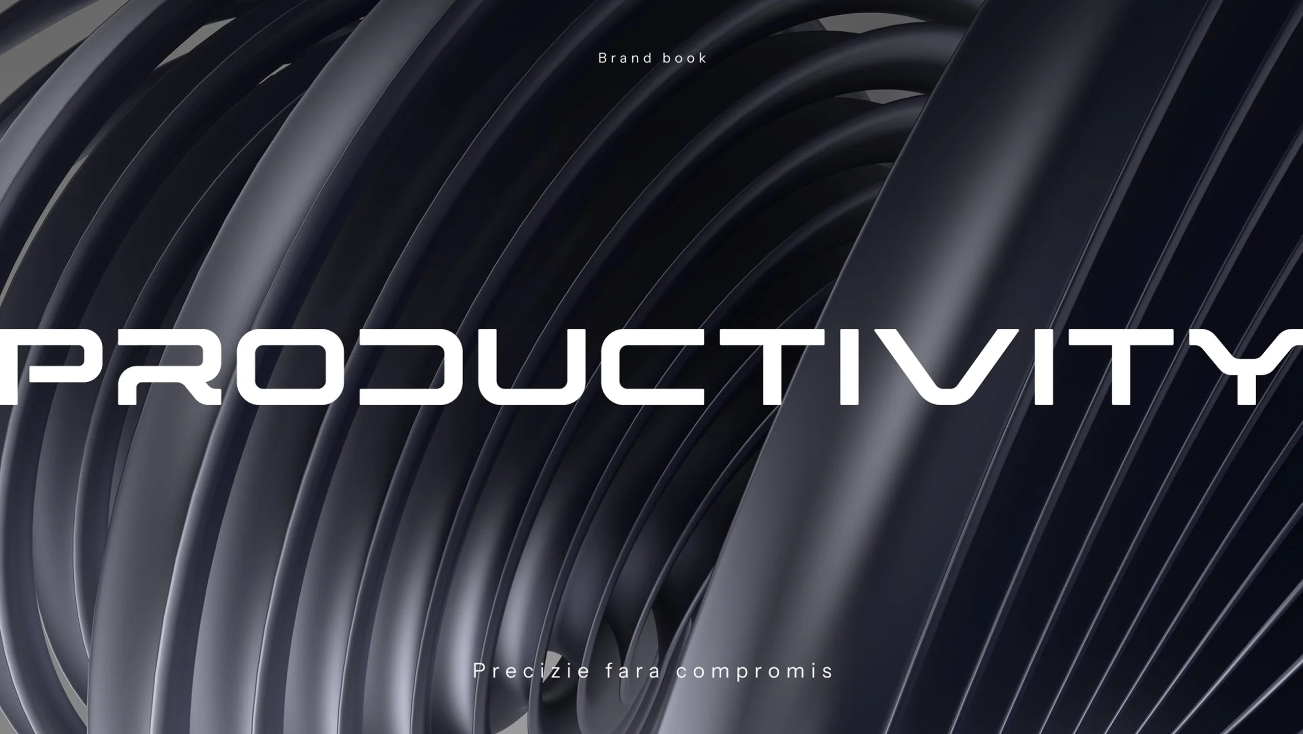
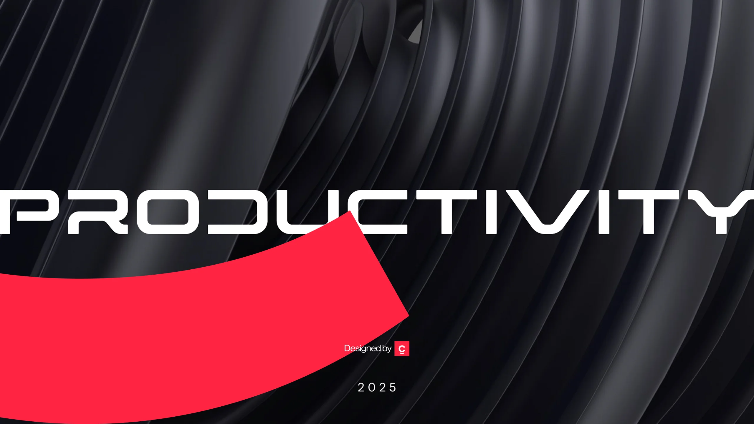
The Productivity logo is both mechanical and elegant. The wordmark, built in Riporno, projects industrial confidence through consistent line weights and calculated spacing. Its visual rhythm is engineered to mirror the balance of CNC machinery — nothing feels random, every angle has purpose.
The icon accompanying the logotype is inspired by a CNC milling drill bit, rendered through geometric precision and symmetry. Its downward-pointing form symbolizes focus, penetration, and controlled force — the essence of what the brand represents. The mark works equally well in metallic emboss, print, or digital use, thanks to its clean vector structure. It’s not just an emblem; it’s the distilled form of Productivity’s promise: engineered performance through precision.
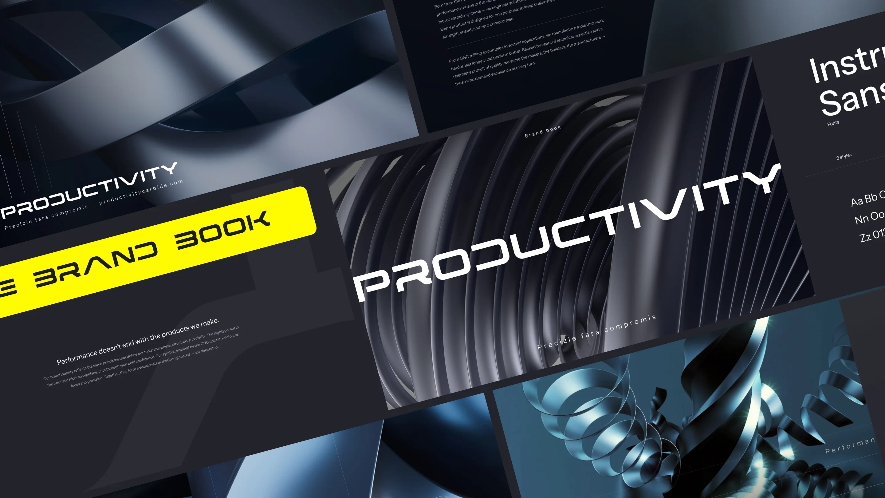
Brand Book: The Blueprint of Consistency
Creatif developed a detailed brand book to govern every visual and verbal expression of Productivity. It defines logo usage, color codes, typography hierarchy, clear space rules, grid systems, tone of voice, and applications across various media. Designed with the same precision that the brand represents, the brand book ensures that every instance of Productivity — from a digital ad to a machine label — communicates the same strength, clarity, and technical expertise.
Multiple Logo Placements and Applications
We designed multiple logo placements and variations to maintain versatility across mediums. The primary horizontal lock-up — symbol plus logotype — serves as the brand’s standard for digital and print communication. The stacked version is optimized for square compositions, machinery labeling, and compact placements where vertical space enhances balance. The symbol-only version is used as a brand signature across social media, interface icons, and metallic engravings on physical tools.
In web and motion environments, the symbol is subtly animated to rotate or pulse, evoking the motion of a real CNC drill. For large-scale print or interior graphics, we apply the icon at very low opacity as a structural background element — reinforcing the brand’s technical DNA without overpowering the content. Each placement adheres to a clear visual grid, ensuring alignment, consistency, and precision across every touchpoint.
Abstract Motion Lines: Visualizing the Energy of Precision
To complement the static power of the logo, we introduced abstract circular motion lines — fluid forms inspired by the kinetic movement of a drill. These lines express momentum, torque, and rotational precision, turning technical motion into visual poetry. Used across digital layouts, backgrounds, and product imagery, the lines bring a sense of continuity and depth to the brand. They embody the constant rhythm of productivity — always moving, always refining.
Color Palette: Industrial Strength Meets Digital Clarity
The color palette balances technical reliability with bold innovation. Deep graphite (#22232B), steel gray (#3D3E48), and carbon black (#1C1C1C) create a foundation of stability and endurance. These tones reflect the raw materials of engineering — steel, carbide, and iron. To energize the palette, we introduced Volt Yellow (#FFFA00), a high-contrast accent that injects vitality, light, and focus. It functions as both a highlight color and a symbol of innovation — a visual spark that brings movement to every surface.

Supporting neutrals such as Graphite Steel (#2A2B35), Concrete Mist (#ABABAD), and Stone Dust (#DFDCD7) provide balance and hierarchy within the system, ensuring seamless integration across digital and printed applications. The overall palette feels industrial yet refined, technical yet approachable — perfectly aligned with the brand’s positioning.
Typography: Riporno and Instrument Sans
Typography became the backbone of the brand’s personality. The logotype uses Riporno, a futuristic all-caps typeface defined by sharp geometry and symmetrical rhythm. We selected it for its architectural qualities — it looks engineered rather than drawn, echoing the precision of CNC machining. The angular shapes of Riporno’s characters embody power, structure, and technical focus. It’s assertive and instantly recognizable, perfect for a logo that must hold its ground against metallic textures and industrial environments.
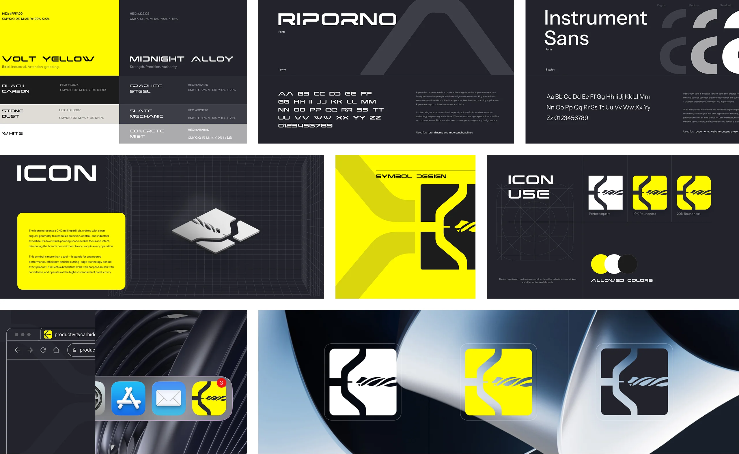
Supporting the logotype, the brand system and digital applications use Instrument Sans, a clean and highly legible variable sans-serif. This font balances precision with subtle warmth, making it ideal for extended text, interface elements, and technical documentation. While Riporno represents the brand’s bold identity, Instrument Sans brings usability, consistency, and calm refinement to the design. Together, the two fonts form a complementary typographic system — one delivering impact, the other ensuring clarity.
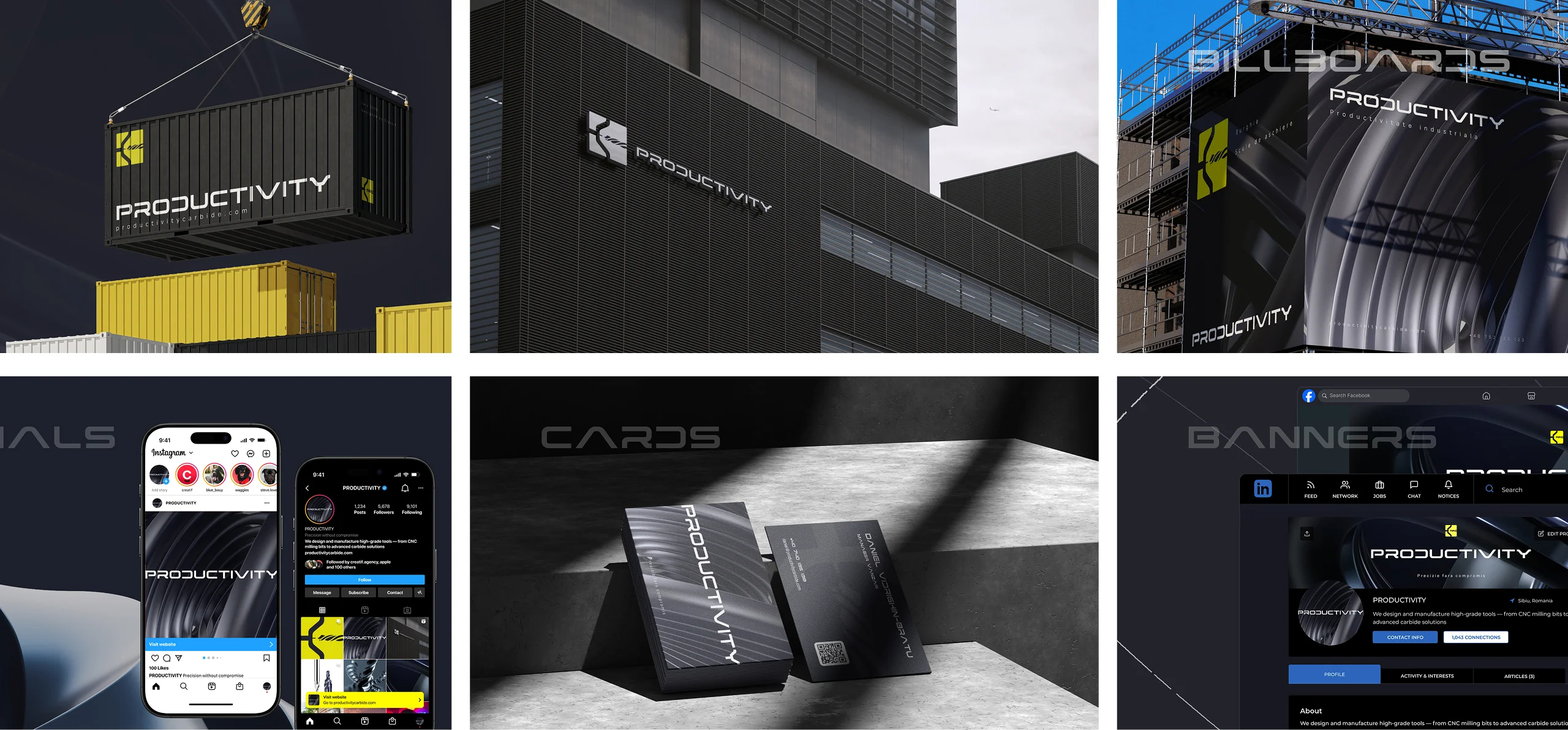
Business Cards and Stationery Design
The business cards carry the same engineered aesthetic: black matte stock, embossed metallic symbol, and Volt Yellow edge accents. The typography follows the same system, using Riporno for the name and Instrument Sans for details, achieving a perfect balance between authority and refinement. The stationery suite — letterheads, envelopes, and digital templates — maintains visual continuity, ensuring that every communication reinforces the brand’s professional precision.
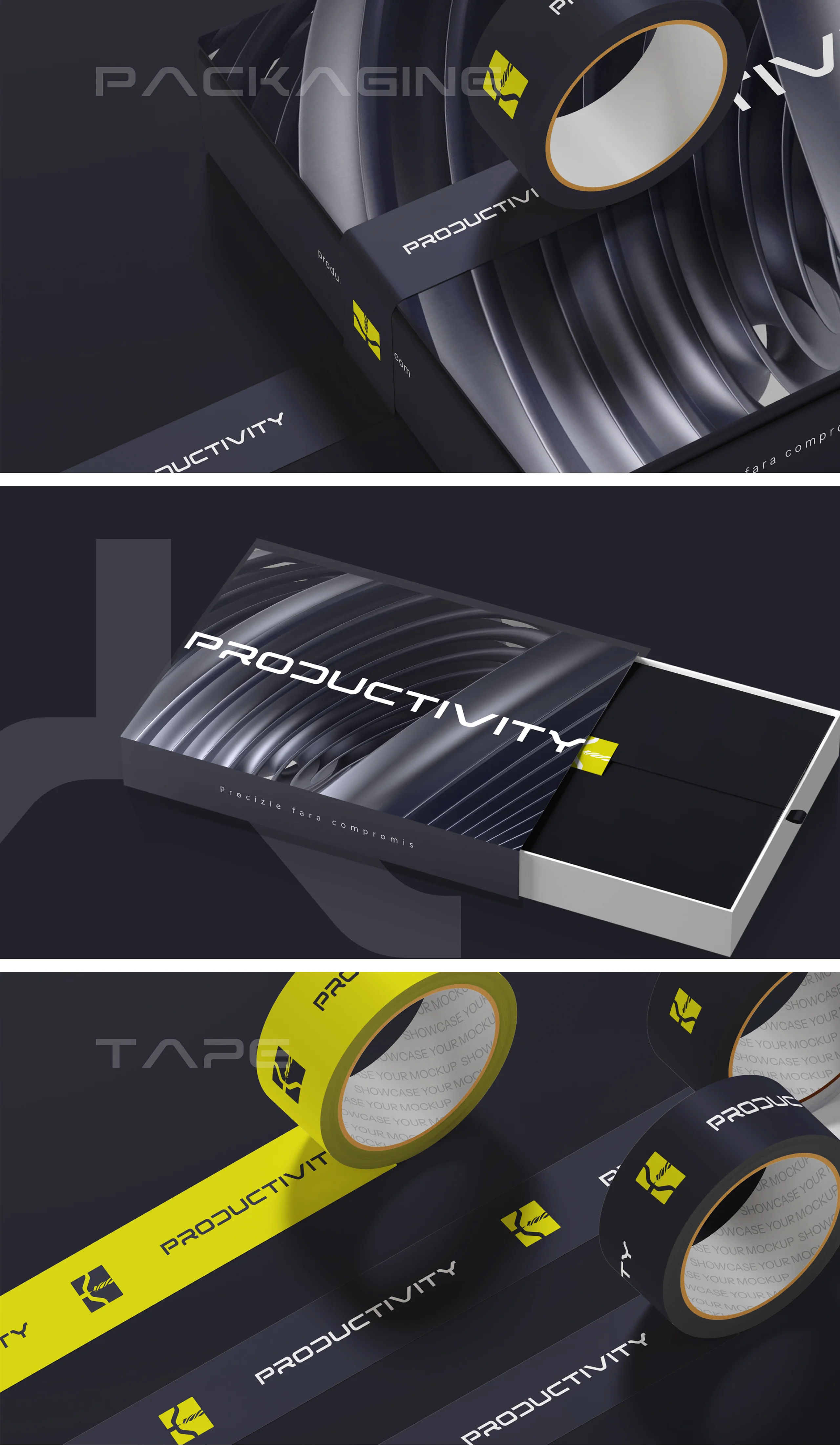
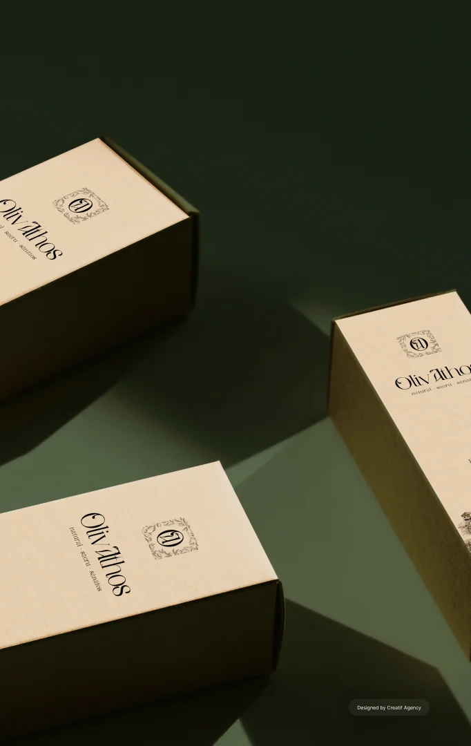
Packaging Design: Industrial Minimalism in Form
The packaging system for Productivity’s product line extends the visual identity into physical space. Each box and label was designed with clean geometry, dark graphite bases, and vibrant yellow accents for instant recognition. Minimal technical illustrations and structured layouts ensure that information remains accessible and precise. The design reflects the brand’s industrial DNA — bold, minimal, and engineered to perform in both retail and professional environments. Materials and finishes were chosen for their durability, mirroring the resilience of the tools they protect.
Billboard and Outdoor Communication
For billboards and outdoor advertising, we created large-format compositions focused on bold contrasts and minimal messaging. The Productivity symbol serves as a dominant structural background, while strong typography and Volt Yellow accents drive instant recognition. These designs are built to perform at scale — commanding attention in industrial zones, trade fairs, or transportation hubs, while
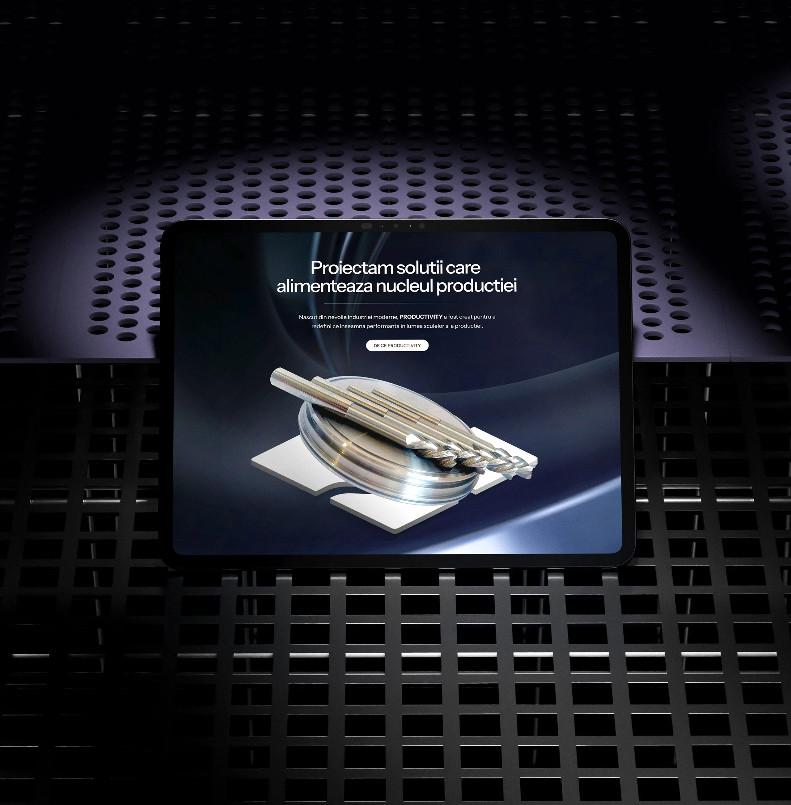
Web Design: Translating Precision into Digital Experience
Once the identity was finalized, Creatif Agency developed a one-page landing website that translates the brand’s industrial values into an interactive digital experience. The layout follows a modular structure inspired by machine grids and cutting paths, giving the site a sense of engineered order. Scroll-based animations, dynamic parallax effects, and smooth transitions mimic the rotational energy of the brand’s symbol and motion lines.
The design emphasizes visual hierarchy and usability. Strong typography, precise spacing, and consistent use of brand colors create an interface that feels structured and deliberate. Every interaction — from hover states to transitions — reflects motion and balance, mirroring the mechanical precision of Productivity’s tools. The site is fully optimized for responsiveness and performance, ensuring a fast, fluid experience across all devices.
Design System: Harmony Between Form and Function
Across print, digital, and environmental applications, the brand system maintains an equilibrium between strength and minimalism. Geometric order, controlled grids, and technical consistency define every composition. Negative space is treated as an essential design component — it allows precision to breathe. The visual balance between the sharp logotype and the dynamic motion lines reflects the dual nature of the brand: static stability and constant innovation.
Conclusion: A Brand Engineered for the Future
With Productivity, Creatif Agency created more than an identity — we built an entire design ecosystem that reflects the spirit of modern industry. From the logo and fonts to the dynamic website and color system, every element speaks the same visual language of precision, performance, and purpose. The result is a brand that feels powerful, engineered, and timeless — one that captures the momentum of true productivity.