What good UX actually means for a business website
Good UX for a business website means the right person can understand what you do, why it is relevant to them, and what to do next, without friction, without confusion, and without effort. It is not a visual discipline. It is a communication and conversion discipline. This article covers what good UX actually means in practice, how it differs from aesthetic quality, and what it produces commercially for businesses that get it right.
UX is one of the most overused and least understood terms in web design. Most people hear it and think of clean interfaces, minimal layouts, and smooth animations. Those things can be part of good UX. They can also be part of terrible UX applied to a beautiful shell. User experience is not what a website looks like. It is what a website does, how efficiently it moves the right person from arriving to understanding to acting, without friction, without confusion, and without having to work for information they came to find. For a business website, that distinction is commercial. A site with good UX converts. A site with poor UX bleeds opportunity regardless of how considered the visual design is.
UX is a communication discipline, not a design one
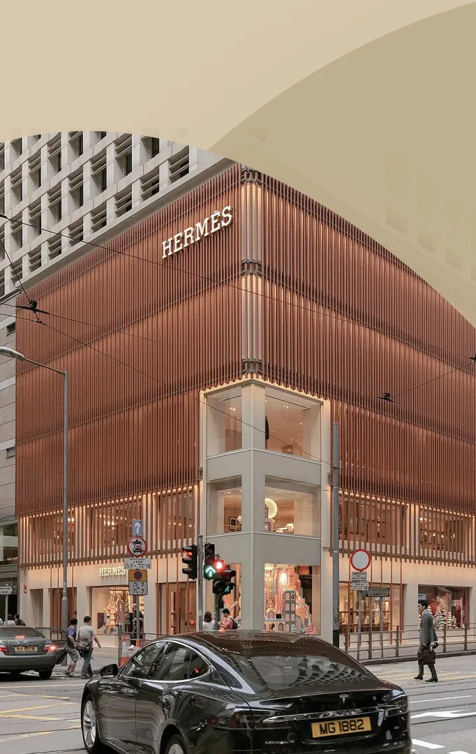
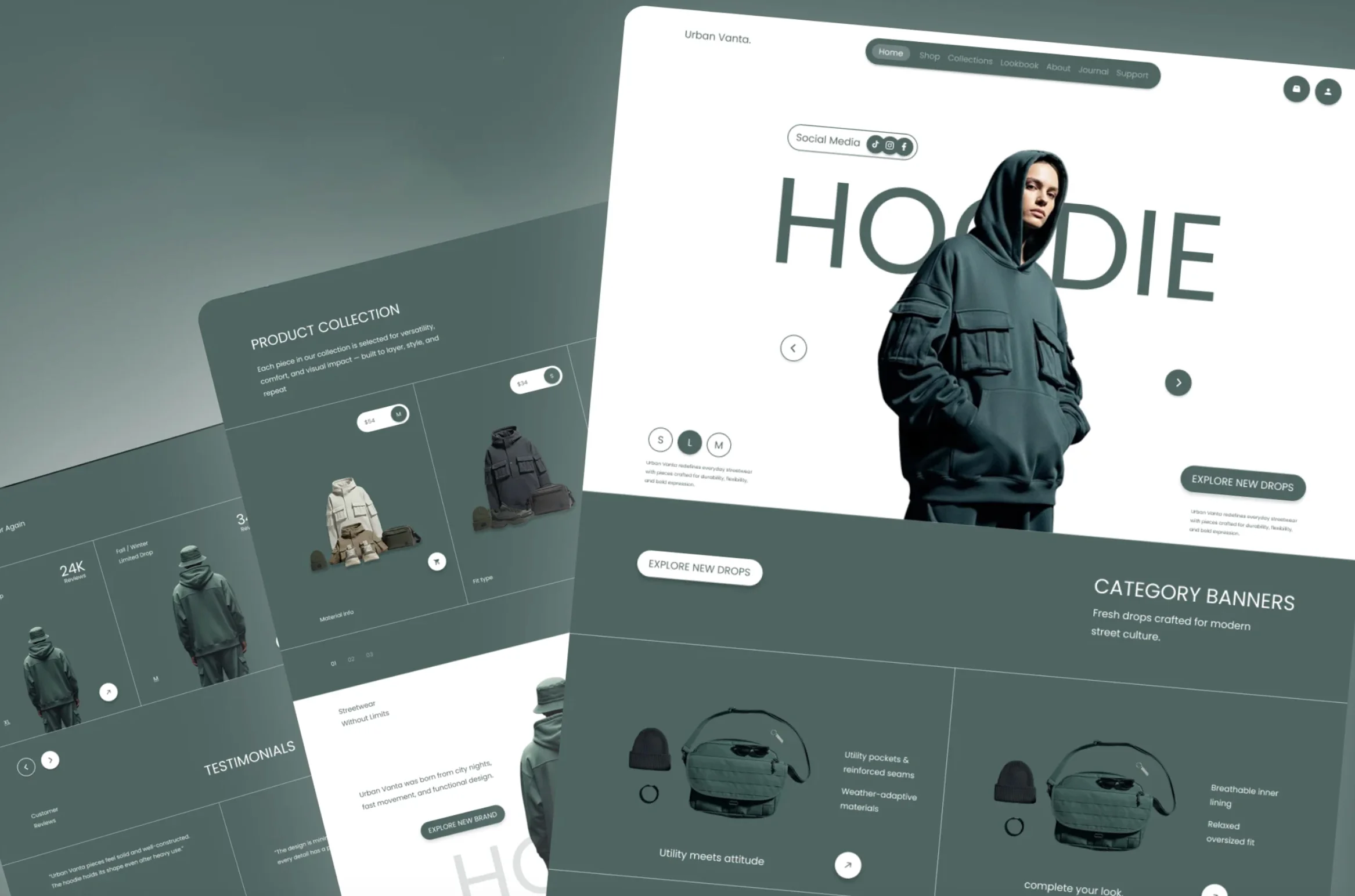
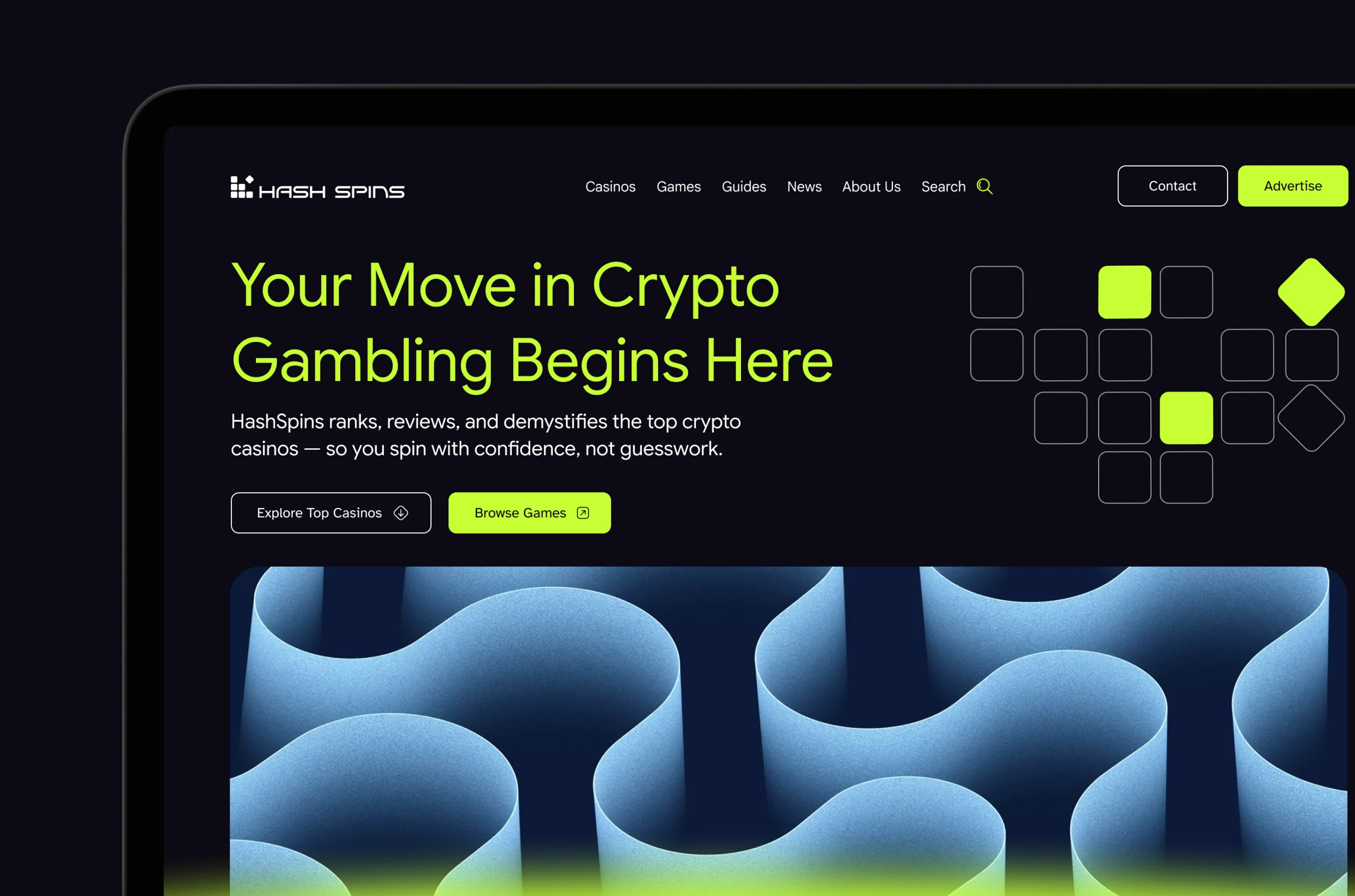
The most common mistake businesses make when thinking about UX is treating it as a design problem. It is not. It is a communication problem. The fundamental question UX answers is: can the person who arrives on this site understand what they need to understand, and do what they need to do, as efficiently as possible? That question does not start with typefaces or colour palettes. It starts with who is arriving, what they know when they land, what they are trying to determine, and what would make them confident enough to take the next step. The visual design serves that communication goal. When it precedes it, when the site is designed and then the messaging is written to fit the layout, the result is a site that looks intentional but communicates incidentally. The hierarchy is wrong and the user experience suffers because the design was never actually built around the user. This is why every Creatif Agency web design project begins with strategy and messaging before a layout is considered. The structure of the page, what appears first, what follows, where the proof sits, where the call to action lives, is determined by the communication goal, not by visual convention.
What good UX looks like in practice
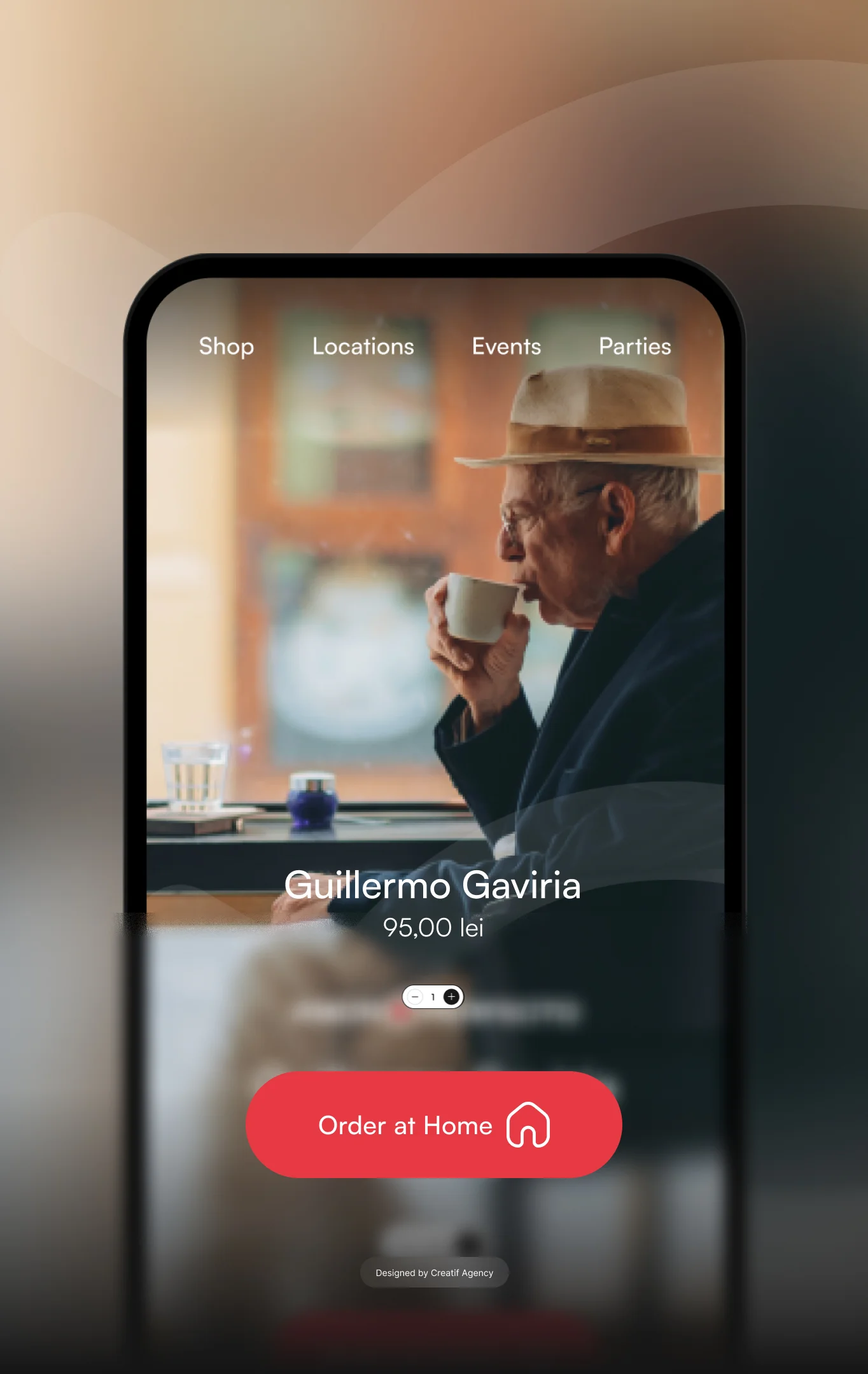
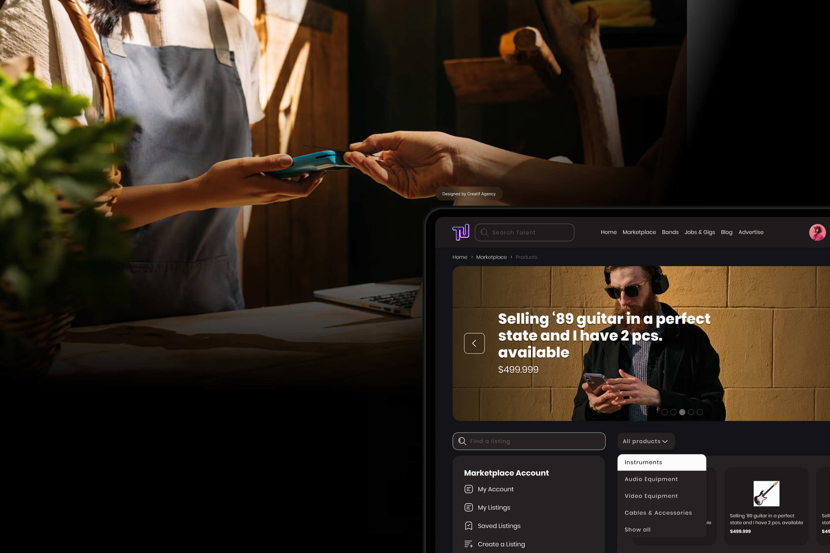
On a business website, good UX manifests in five specific ways. The first is immediate clarity. A visitor should understand what the business does and who it serves within the first few seconds of landing, without scrolling, without reading a paragraph, and without interpreting. If the homepage hero requires interpretation, the UX is already failing. The second is a logical hierarchy. Information should be sequenced in the order a visitor naturally needs it, from the broadest answer to the deepest proof. What you do, who you do it for, why you are credible, what working with you looks like, and what to do next. That sequence exists because it mirrors how a decision is made, not because it follows a template. The third is frictionless navigation. Every additional click between a visitor and the information they need is a drop-off risk. Good UX eliminates unnecessary steps without hiding depth. The fourth is trust architecture, proof signals placed at the moments of doubt, not decoratively distributed across the page. A testimonial in the footer earns nothing. A proof point adjacent to the call to action earns the conversion. The fifth is a clear path to action, one primary call to action per page, placed where it logically follows from the content that precedes it, with secondary options available for visitors at different stages of the decision.
The relationship between UX and conversion
The commercial case for good UX is direct and measurable. A site where visitors understand the value proposition immediately, trust the business quickly, and know exactly what to do next converts at a meaningfully higher rate than one that makes the visitor work for any of those things. Every layer of friction, an unclear headline, a navigation structure that buries the service pages, a contact form that asks for more information than necessary, a mobile experience that breaks the layout, costs conversions. The compounding effect of removing friction across the full page is significant. Good UX also ensures that the best parts of the site are encountered by the people most likely to act on them. A strong case study buried three clicks deep will not be read by the visitors who most need to see it. A compelling testimonial that appears below the fold on mobile will not be seen by the majority of visitors who leave before they scroll that far. This is precisely why bespoke web design built around a specific audience and a specific conversion goal performs differently from a template built for a generic visitor.
UX on mobile is not a secondary consideration
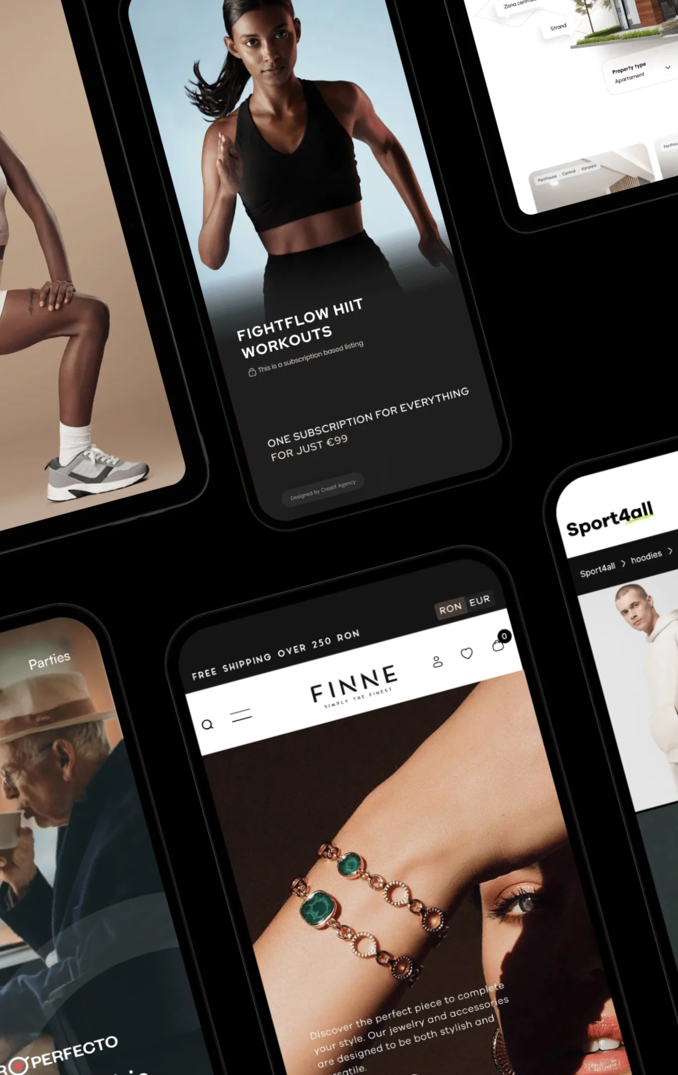
Over 60% of web traffic arrives on mobile devices. For most business websites, that proportion is significant enough that mobile UX is not an adaptation of the desktop experience, it is the primary design consideration. A site designed for desktop and then made responsive is not the same as a site designed mobile-first. The difference shows up in how content is prioritised when the viewport is narrow, how touch targets are sized, how long forms are handled, and how the path from landing to contact is structured for a user with a thumb on a smaller screen. At Creatif Agency, mobile-first is not a checkbox in the brief. It is a foundational design decision that shapes how every page is structured before the desktop layout is considered.
What bad UX costs a business
Bad UX is not an aesthetic problem. It is a revenue problem. A visitor who arrives on a site and cannot quickly determine whether it is relevant to them leaves and does not return. A prospect who lands on a contact page with an eight-field form closes the tab. A mobile user whose screen shows a layout that requires horizontal scrolling does not forgive the experience because the desktop version looks good. These losses are invisible in the sense that they show up as traffic that did not convert rather than as visible failures, but they are real and measurable. A site that converts at 1% when it should convert at 3% is losing two thirds of its potential enquiries to UX failures that most businesses do not notice because they are looking at design quality rather than communication effectiveness. A properly built corporate web design or startup web design project eliminates these failures at the structural level, not through surface fixes applied after launch.
FAQ — what good UX means for a business website
What does UX mean for a business website? UX refers to how effectively a website serves the person using it. For a business website, good UX means a visitor can understand what the business does, determine whether it is relevant to them, build confidence in the brand, and take a next step, without friction or confusion at any stage of that process.
Is UX the same as web design?
No. Web design covers the visual and structural execution of a site. UX is about whether that execution serves the user’s needs effectively. A site can be visually accomplished and have poor UX if the hierarchy is wrong, the messaging is unclear, or the conversion path is obstructed.
How does UX affect conversion rate?
Directly. Every layer of friction in the user journey reduces the proportion of visitors who convert. Removing friction at each stage compounds. A custom web design built around a defined user journey consistently outperforms a template built for a generic visitor.
What is the most important UX element on a business website?
Clarity above the fold, the content visible before any scrolling. If a visitor cannot determine what the business does and why it is relevant to them within the first few seconds, the rest of the page does not matter for most users. Everything else in the UX hierarchy depends on this initial moment being resolved correctly.
Should mobile UX be designed separately from desktop?
Mobile should be the primary design consideration, not a secondary adaptation. A site designed for desktop and made responsive is a different and usually weaker experience than one designed mobile-first. Given that the majority of web traffic arrives on mobile, the mobile experience is the experience for most visitors.
How does Creatif Agency approach UX in web design projects?
Every project begins with understanding the audience, who arrives, what they know, what they need to determine, and what would move them to act. Page structure, information hierarchy, and conversion architecture are all defined before visual design begins. Contact our team to discuss a project.