How we structure startup landing pages for paid campaigns
We structure startup landing pages by matching ad intent to one clear offer, then building a hierarchy of outcome, mechanism, proof, objections, and one primary call to action. We keep the page modular for testing, fast for mobile, and measurable through clean tracking. This approach reduces bounce, improves conversion rates, and protects budget by removing uncertainty early.

Paid campaigns do not fail because your ads are weak, they fail because the landing page wastes attention. When you pay for clicks, every extra second of confusion becomes a cost. A startup landing page must continue the promise made in the ad and deliver clarity instantly. That means one offer, one audience slice, one conversion path, and a structure that removes friction fast.
We structure startup landing pages as conversion assets, not as mini homepages. A homepage can serve multiple audiences and tell a broader story. A paid landing page has one job: turn paid intent into a measurable action. If the page looks beautiful but the message is vague, you will pay more for worse leads. If the page is clear, proof-driven, and fast, you can scale spend without collapsing performance.
Who this framework is for
This structure is designed for startups running paid campaigns on LinkedIn, Meta, Google, and other intent-driven channels. It works especially well for B2B SaaS, services, and product-led companies with a clear next step. It also works for funded startups that need to turn attention into demos or calls quickly. If you sell to multiple segments, this framework becomes even more valuable when you create segment-specific pages.
The core principle: one page, one job
A paid landing page must focus on one primary action and protect that action from distraction. The action might be book a call, request a demo, start a trial, or purchase now. The CTA must stay consistent across the page, even when the copy deepens. When a page introduces multiple competing CTAs, it fractures attention and increases drop-off.
We also design for one intent level at a time, because cold clicks and warm clicks behave differently. Cold traffic needs clarity, proof, and low friction, because skepticism is higher. Warm traffic needs specificity and differentiation, because basic awareness already exists. Retargeting needs fewer explanations and stronger triggers, because the user is already familiar.
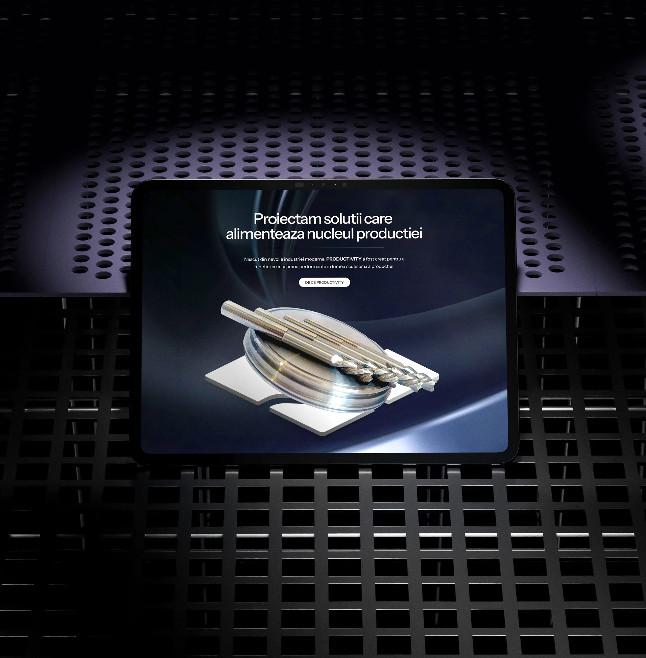
The packaging system for Productivity’s product line extends the visual identity into physical space. Each box and label was designed with clean geometry, dark graphite bases, and vibrant yellow accents for instant recognition. Minimal technical illustrations and structured layouts ensure that information remains accessible and precise. The design reflects the brand’s industrial DNA — bold, minimal, and engineered to perform in both retail and professional environments. Materials and finishes were chosen for their durability, mirroring the resilience of the tools they protect.
Step 1: align campaign intent with one landing page offer
Before any design happens, we lock the offer that the landing page is selling. An offer is not a list of features, it is a clear exchange. The user gives attention and possibly contact details, and they receive a specific next step or outcome. If your offer cannot fit into one sentence, your landing page will be unfocused.
We align the offer tightly with the ad promise, because message mismatch destroys conversion. If your ad offers a demo, the page must lead with the demo value, not brand story. If your ad offers a guide, the page must sell the guide as the next step, not a broad “contact us.” Paid traffic does not tolerate unnecessary detours.
https://creatif.agency/branding/
A quick offer test we use
If a stranger can read your headline once and explain your offer back correctly, it passes. If they ask what you actually do, the headline fails. If you need multiple clauses to qualify the promise, the offer is too broad. If you must educate before making the offer, split the page into a warmer funnel step.
Step 2: build the above-the-fold structure first
The above-the-fold area is the most expensive part of your funnel, because every click lands there. It must communicate value within seconds, especially on mobile. We design above the fold as a decision-making packet, not as a design showcase.
A high-performing above-the-fold structure usually includes a headline, a subheadline, three outcome-led bullets, and one CTA. We add a trust cue near the CTA, such as a metric, a credible category signal, or a short proof statement. We also keep visuals functional, using screenshots or a simple diagram that clarifies the offer. Decorative imagery often increases bounce because it adds confusion.
Headlines that work under paid clicks
We write headlines that speak in outcomes, not in internal language. We name the audience when the campaign is segmented and name the result when it is broad. We avoid vague claims, because vague claims feel untrustworthy under interruption. Good paid headlines create instant relevance and reduce cognitive load.
Step 3: create a message hierarchy that matches how people decide
Users do not read landing pages top to bottom, they scan for meaning and credibility. We structure the page so the most decision-critical information appears early. Then we deepen the case as users scroll, adding proof and objection handling at the right moments.
A reliable hierarchy for startup landing pages is outcome, audience fit, mechanism, proof, objections, and action. The outcome tells the user why they should care now. Audience fit confirms the page is for them. The mechanism explains how the outcome happens. Proof reduces perceived risk. Objections remove friction. The CTA captures the decision.
This hierarchy also makes copy easier to write, because you are not guessing what to say next. You are simply answering buyer questions in a logical order, using simple blocks with clear headings.
Step 4: build proof as a system, not a single section
Proof is the strongest lever for paid conversion, because paid traffic arrives skeptical. A testimonial section near the bottom is not enough. We build proof into the page at multiple points, using different proof types for different doubts.
We typically use three proof layers: social proof, performance proof, and process proof. Social proof includes client categories, partner signals, and credible endorsements when available. Performance proof includes metrics, outcomes, and case snippets that show results. Process proof includes screenshots, workflow explanations, and feature clarity that reduces uncertainty.
For early-stage startups without major logos, process proof and clarity often outperform generic testimonials. A clear product flow, a specific use case, and a credible explanation of how results happen can convert better than vague social proof. Proof must feel real and relevant, not staged.
Step 5: handle objections before the user hesitates
Most paid clicks bounce because the user hits an unanswered doubt. Doubts are predictable: is this for me, will it work, how hard is setup, what will it cost, and what happens next. If these questions are not answered, the user stalls and leaves.
We write objection blocks as short, direct sections with clear headings. We do not write defensive paragraphs, and we do not hide important constraints. Clear constraints build trust faster than forced optimism. This is also where FAQs help, because they mirror real hesitation patterns.
Common startup objections include time to value, implementation effort, integrations, data security, and fit for certain company sizes. When you answer objections cleanly, conversion becomes a natural next step instead of a leap of faith.
Step 6: keep one CTA path and repeat it strategically
A landing page needs one primary CTA repeated after major persuasion blocks. We place the CTA above the fold, then repeat it after proof sections and after objection handling. Each repetition feels earned, because it follows new information.
We reduce friction around the CTA using microcopy that explains what happens next. Users fear uncertainty more than they fear forms. If you clarify response time, next steps, and whether the call is commitment-free, conversion improves. This is especially true on LinkedIn and high-intent B2B traffic, where users want control.
Forms that convert without killing lead quality
For cold traffic, shorter forms convert better, because the user has not yet earned the relationship. If lead quality is a concern, qualify after the first conversion step, not before it. Two-step forms can also improve performance by increasing commitment through the initial click. If the offer is a demo, the form should match the promise, not ask for unnecessary details.
Step 7: match page design to intent, not to trends
Landing page design must make scanning effortless and trust immediate. We rely on hierarchy, spacing, and typography discipline, because those elements improve comprehension. We avoid heavy animation, complex backgrounds, and design effects that slow reading. When people arrive from paid ads, they want answers, not a gallery.
We design mobile-first because paid traffic frequently lands on mobile, even for B2B. That means clear tap targets, fast load time, and sections that read well on smaller screens. A beautiful desktop page can still fail if mobile is cramped or slow.
Step 8: build for speed and measurement from day one
Performance is conversion, because slow pages lose attention and increase acquisition costs. We optimize images, reduce unnecessary scripts, and keep components lightweight. We also ensure the page is stable, because layout shifts reduce trust instantly.
Measurement matters because landing pages should improve with iteration. We set up tracking for CTA clicks, form submissions, and key drop-off signals. We also ensure attribution is clean so the campaign data remains useful. Without measurement, you cannot optimize, you can only guess.
Step 9: make the page modular so testing is fast
Paid campaigns require iteration, and landing pages should be easy to test without redesigning everything. We build landing pages with modular blocks that can be swapped, reordered, or rewritten without breaking the visual system. That allows headline tests, proof placement tests, CTA wording tests, and offer framing tests.
We also protect test integrity by avoiding too many changes at once. When you change everything, you learn nothing. We structure the page so experiments isolate a few variables and produce clear learning. Over time, these small wins compound and make paid performance more stable.
A practical landing page structure you can follow
Here is the structure we use most often for cold and mixed-intent traffic: headline and subheadline, outcome bullets, CTA with trust cue, mechanism explanation, proof block, use case or workflow, objections section, deeper proof, CTA repetition, FAQ, final CTA. This sequence works because it earns trust progressively while keeping the action consistent.
For warmer traffic, we compress the page and move differentiation earlier. For retargeting, we reduce explanations and strengthen proof and CTA clarity. The structure stays consistent, but the depth changes based on awareness.
Conclusion
A paid landing page should not be a small homepage, it should be a focused conversion asset. When we structure startup landing pages, we align the page to ad intent, lead with outcomes, build proof as a system, handle objections early, and drive one clear action. We keep the page fast, measurable, and modular so performance improves through iteration.
If you want startup landing pages built with this structure, we can map your campaign intent and produce a landing page blueprint that is ready to design and ship. Contact us today.